Tuesday, December 18, 2012

Adding 'condapply' to Scala, for natural JavaFX bindings

The Scala programming language is wonderful, and if anything, it suffers from a little bit too many tweaks and shortcuts (access syntactic sugar).

But here's one more suggestion.

The particular itch is that JavaFX bindings that in some languages can be expressed in a normal if/else:

  def z = bind if (b) then x else y;

 cannot be created so nicely in Scala (or in Java, for that matter) - since if and else are keywords.


  def z = when (b) then x otherwise y;

This is how the current ScalaFX library does it.

Since Scala is a very powerful language, I began to toy with the idea, how it could allow the "natural" binding syntax for ScalaFX. And - I think it can (well, not the current Scala, but it could be added).

Existing apply and unapply

Currently (Scala 2.9) Scala has methods called apply and unapply, which are called when i.e. a function call is invoked on a class. The compiler transforms the (...params...) of the call into a apply(...params...) call for the class. This is very, very common in Scala.

The unapply is used less seldom, in pattern matching (in case you want your class to support this amazing feature fully). Normally classes don't need to do that much (one can use "case classes" that do it automatically).

Anyways, this provides a precedent as to methods where the compiler transforms its syntax into bendy method calls.

Introducing condapply

I would like to call this cond, but that would probably be a bit too common, and it would lose the mental bridge to existing (and well understood) apply and unapply methods. So let's say it's condapply.

  def condapply[T]( t: => T, f: => T = null ): T

That's Scala prototype for a method that takes two "by name" parameters (that simply means, they will be lazily evaluated; only one of them). Both the parameters are expected to provide the same type of value (T), and the method itself will return this very type. If no else branch exists, f will be null.

What ScalaFX could do with this, is to have the Observable trait implement this method, and therefore make Observable's applicable within an if. What the implementation would do is bind that Observable to the two branches t and f (mathing then and otherwise in JavaFX API).

By the Scala prototype the branches would not need to be of the same type as the condition, but here they happen to be.

For cases where there is no else branch, the Scala compiler would create a condapply call with just one parameter. It would be up to the class to catch both cases (either using two separate prototypes, variable argument list, or default parameter for the latter parameter).

The benefits

The suggested addition to Scala would allow conditional bindings to be expressed in the usual if/else syntax, s.a.

  def z = if (b) x else y

It will not render any existing code invalid, since currently the if statement is limited to conditions of type Boolean

Whether it will make code more readable, and easily understandable, is a matter of opinion. Personally, I would probably use it, but also something like:

  def z = bindIf (b) x bindElse y

is quite okay (and can be done without changes to Scala).

Other uses

There may be other uses to the presented technique outside of ScalaFX.

Thursday, November 8, 2012

Oracle - how to be More Believable on OS X

Recently, the baton on Java on OS X was passed from Apple to Oracle. From Java 7 onwards (i.e. now), updates come from Oracle. Also, integration with operating system has changed in various ways.

Most of this is good.

And then there's this.


Instead of nicely integrating the Java Control Panel into where the rest of the settings are (i.e. within the topmost window), Oracle chooses to launch the one below.

There's a plethora of user interface issues here.

1. "About" is topmost on the Control Panel window, on the first (default) pane. It's the *last* thing a user needs. Move it!

2. It simply looks Bad and Boring. This is not in line with the coolness that JavaFX tries to bring to Oracle. Put some meaningful graphics on the first pane?

3. *All* of the four buttons on the first pane have "..." in their captions, meaning you can do *nothing* in this pane alone. Too deep organization.

The reason for this, of course, is that they want to run the Control Panel in Java (it looks just the same in Windows). That's probably a valid excuse for the first OS X version. Not for the long run.

So let's fix this. :)

Don't launch anything new, make things fit in the OS X usual Control Panel (hire some consultant to do it in Objective-C, it's not contagious).

We can probably use the same tabs, but some would benefit from a renaming. Let's check them one by one (sorry that I haven't made any UI sketches on this - have other things to do):

General tab

Drop the "About" from here (moves i.e. to under "Update" where it's more relevant).

Drop "Network settings are used when making Internet connections." *Anyone* (anyone who found the Control Panel, anyways), does know that. Less is more and this simply makes Oracle (the boss within Oracle who demanded this text) look Stupid..

Since you're saying "only advanced users should modify..." why exactly is *this* on the front page, then?

Pressing 'Network Settings...' gives:


This should imho be a "Network" tab of its own, just prior to the "Advanced" tab. You said it yourself. For advanced users. = moved.

Temporary Internet Files has the same "only advanced users should".. mention. By having these right on entry page of the Control Panel you make the occasional Java users (who are millions) think Java is "only for advanced users". Unnecessarily. Move this, too.


There's enough in there to grant a separate, top-level tab (within the real OS X Control Panel area). Let's put "Temporary files" (or "Disk cache") before "Advanced".

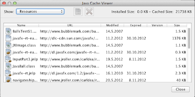
Then there's the "View..." dialog of the initial page (yet one very advanced thingy).

Or actually, it turns out to be almost like a separate application within the Control Panel (which is within the OS X Control Panel). Way too deep - I bet most people never knew this even exists? I did not. :)


It's three things.

"Applications" shows which apps are taking disc space for their cache files. This is great, but... the icons on top allow one to i.e. launch these programs and look into their source code. Someone in charge of this wanted more than one icon, and got it. *Completely unnecessary* within a Control Panel.

Let's make this into a "Cache" tab (for brevity) and just keep the possibility to list the apps and remove their cached data.


"Resources" has things that come from the Internet. Maybe it can be selected like above (show) but maybe the two lists could be put in one, i.e. Apps on top, followed by Resources. 


"Deleted applications" is completely unnecessary. Someone in some meeting wanted to play safe and duplicate a trash bin. Don't Do That. Stick to simplicity. Though Java (well, JVM) is gorgeous, you don't want it to explode on people's faces. They already have enough stuff to take care of. One can always re-install an app from the original place. Trash.

That covers the first, "General" pane, and - nicely - nothing remains on it. I would claim that the proper title for the pane should have been "Miscellaneous" since these really were things that didn't fit anywhere else. Too bad they were placed on the *entry* place of the Java Control Panel.

Update


What a waste of empty space.

Merge this with the "about" popup that comes from the General tab. 


I would bet that the *most* frequently used feature of Java Control Panel is to check which version you are running and possibly upgrade. Make this the entry page (it already has the nice graphics). Don't hide it behind an "About.." button.

That covers the "Update" pane, which now functions as the nice entry page within the Control Panel.

Java

It's kind of awkward to have a "Java" pane within a "Java Control Panel", isn't it? If this pane is "Java", what are the others?


Again, you probably noticed the (lack of) use of empty space, and making people push yet another Button... (A copy of this pane alone would make for 15 minutes of teaching at a University Usability Course - if people would learn by bad examples, which they don't). :)

Ok, let's be humble and press the "View..."


There comes "Java Runtime Environment Settings".

Let's forget about the unnecessary interim "Java" tab and call the tab "Runtimes" at once.

However, knowing that in the Oracle way of distributing Java for OS X there is only one runtime at any one time, I wonder what's actually the point of all this. Apple had a similar list where one could manage multiple Java Runtimes. Oracle itself has said this was a very, very bad idea. So .... what is this for?

Security


"Use certificates to positively identify .. certifications." Yeah, right.

- empty space
- button...

Just call the whole page "Certificates", and have this (what pops up by pressing the button) right on the topmost level:


Certificates is probably an even more advanced issue than Network and Temporary Files and therefore deserves to be listed after them.

Advanced


This can probably remain pretty much as-is, since the name anyways implies you should know what you're doing. A tiny help pane on the right side for getting info on the settings might not hurt (especially since the OS X Control Panel would have more horizontal page available).

Maybe reduce the font size a bit. It's advanced. There are many options. Smaller font size means I can get a better overall view at once.

Altogether, now

So the current (Oracle Java 7 SE) Java Control Panel organization is like this:

General
   About...
   Network Settings...
   Settings...
   View...
Update
Java
   View...
Security
   Certificates...
Advanced

The proposed flatter organization is:

Update
Network
Temporary Files
Caches
Runtime   (if required)
Certificates
Other

Since essentially all the entries (except for 'Update') are advanced (already declared so in the current Control Panel implementation), it is probably in place to re-title the earlier "Advanced" as "Other".

The Theory

I've developed a theory (mainly by observing XBox/Zune and other Microsoft mess-ups) that the internal structure of an organization is traceable in the software it produces. That is, unless a special effort is taken to smoothen such borderlines from the eyes of the user. I bet that the issues mentioned above are not coming from developers. They reflect something within probably Sun and not Oracle that caused this kind of approaches to be taken. It is sad if such usability failures are allowed to live further over the years, since *this* is what most people will feel when they touch Java. Is it flat, easy and good-looking. Or is it unnecessarily structural, hard to handle, and aging.

Oracle, please decide.

Wednesday, October 31, 2012

An IDE for ScalaFX development? Yes - PLEEEEEASE!

This entry should tell you how to get an IDE (Integrated Development Environment) up and running for Scala development - and especially for ScalaFX (graphics application) development.

It shouldn't be even this difficult (and most likely will become easier over the years).

The *current* (Oct 2012) situation is that I fought over a week with Eclipse Juno without still getting it to fully work. With IntelliJ the fight was roughly half a day (not bad). 

With this text, you'll be up and running within an hour.

You shall need:
- OS X
- Scala 2.9.2 installed via HomeBrew.
- ScalaFX jar precompiled

You probably should read this earlier blog post first.


- Download "IntelliJ IDEA". Use the "Early Adapter Program" (recommended for Scala plugin to work) and take IDEA 12 (it has a great duck splash screen):

http://confluence.jetbrains.net/display/IDEADEV/IDEA+12+EAP   ( I took version 'idealC-122.639.dmg'. )

- Drag 'Leda-IC-122.639' app to somewhere (i.e. /Applications).

- Launch it and pick 'Open plugin manager' (top right corner of the welcome page):

- "Browser repositories…" > choose "Scala" plugin (v.0.6.287) (double click to download & install)
- You may also wish to install "SBT" plugin but it seems to only provide compilation help, not sure how it can be used for debugging.
- restart IntelliJ

THIS IS IMPORTANT!!!

In order to use the Scala plugin, it needs to be given a "language facet", essentially libraries that tell where Scala compiler & libraries can be found.

We'll do it here using the command-line-installed ("brew install scala") version 2.9.2 files.

- Create a project (i.e. from scratch)

Select type: "Java module"

Click "Scala" on the "desired technologies" page (below) and fill the "Create compiler library" and "Create standard library" names to your liking (and probably you want them to be 'global').

We'll make these point to the right HomeBrew-loaded jar's in a minute.


You should get to the main IDE soon.


There's a ton of things you should go through in File > Project Structure… Do it now.

Within there, you see 'Modules > Scala' that should be like this:


Notice that "scala-compiler" is selected as the way to compile Scala. This points to the scala-compiler.jar and scala-library.jar that we'll now define under "Global Libraries" (last entry of the "Project Structure…" dialog):

Make the entries look like this (in case you do have Scala 2.9.2 via 'brew'):


This should allow IDEA to compile Scala. 

NOTE: It is absolutely essential that you only play with one version of Scala. Don't download "another" 2.9.2 and make IDEA point to it (did not work - at least not for me).

- Within "Project Structure… > Libraries" add 'scalafx-1.0-SNAPSHOT.jar' (that you've snitched earlier, compiled with the same Scala version):


- To compile, "Build > Rebuild project" (I'm not a fan of automatic build)

- To start code, right click i.e. on 'Main.scala' and take 'run MainFX.main()' (no breakpoints etc.) or 'Debug 'MainFX.main()' (will stop at breakpoints).

Did it work?

Note that i.e. renaming the "Scala compiler library" seems to be enough to throw the "Scala facet" setting off the wall, and requires it to be reset ("Project Structure… > Facets)

References:

http://confluence.jetbrains.net/display/SCA/Getting+Started+with+IntelliJ+IDEA+Scala+Plugin


Saturday, October 20, 2012

Replicator service for spare parts, anyone? (mail order, reasonable price, scanning included)

I broke a small part of a classic table lamp recently, and am now considering the options of how to fix the damage.

Glue will probably not be strong enough. Wood will take time and not be 1:1 with the original.

Are there any 3d-printing shops available (within Finland, EU or globally) which would also offer the necessary scanning for actual replication of existing parts?

Ideally, they would extend the missing part, and give me perfect holder piece that lasts the next 40 years.


We thought this was science fiction. Star Trek has it. But the technology is there, and the business model is simple. I'm sure there's someone already out doing this - please find me. I'm your customer! :)

Contact either by comment here, email to akauppi(at)welho.com or twitter @bmdesignhki.

Addendum.

Got the parts done, in bright Xmas Red. Lamp says Thank you, Robin B!


Wednesday, October 17, 2012

Getting ScalaFX 2.2 demo up and running on OS X (with Oracle Java 7u7)

News 20-Oct-2012 - JDK 7u9 and a JavaFX 2.2.3 samples are out:


Use those files instead of the 7u7 mentioned below. The performance of some JavaFX Ensemble demos is now way better on the NVidia 9400 GPU (but not all). Also, there are new demos included in the bundle.


JavaFX is a 2d/3d GPU-accelerated graphics library that is going to be replacing the Swing as the main Java application UI library.

ScalaFX is a Scala language binding to JavaFX.

JavaFX development kit is distributed as an integral part of the general Java 7.x development kit (JDK), by Oracle.

Below are the steps to get a basic ScalaFX project started, developing on OS X.

You will need:
- OS X 10.7.3 or later ("Lion" or later) (a JDK 7u7 requirement)
- Basic experience on command line usage on OS X
- HomeBrew (or similar) command line tool installation system ('brew' is great and easy to install)
- Willingness to accept the Oracle 7.x JDK license agreement


Getting ScalaFX and JavaFX 2.1 running on OS X

Java SE 7 Update 7 (or later)

Download and install "Java SE 7u7" (or later) from Oracle:

Take these files:
jdk-7u7-macosx-x64.tar.gz
javafx_samples-2_2_0-macosx-universal.zip

The JDK (development kit) contains the JRE (runtime engine) so just a single install is sufficient.

Installation FAQ:

Note for users with Apple Java 6:

JDK 7 Installation for Mac OS X:

In short, just install the .pkg file by double-clicking. It will not replace the Apple Java 6 (in case you have Java enabled). You will need Java 7 for JavaFX 2.2 to function on OS X.

<<
You can determine which version of the JDK is the default by typing java -version in a Terminal window. If the installed version is 7u6, you will see a string that includes the text 1.7.0_06. For example:
    % java -version
    java version "1.7.0_06-ea"
    Java(TM) SE Runtime Environment (build 1.7.0_06-ea-b13)
    Java HotSpot(TM) 64-Bit Server VM (build 23.2-b04, mixed mode)
To run a different version of Java, either specify the full path, or use the java_home tool:
    /usr/libexec/java_home -v 1.7.0_06 --exec javac -version
<<

JavaFX samples

Likely you already downloaded these (see URL and filename above).

Extract the files to some suitable directory.

To launch the .jar files, right-click and select 'Open in Jar Launcher > Run (or Open or something)'. This seems the way to bypass safety system preventing to launch .jar by a simple double click.

On OS X, they don't (yet) support launching from the HTML files. Ignore them. )

The UI responsiveness may be sluggish at times. This may be because of lack of optimization for hardware (GPU) rendering. Oracle site says any GPU supported by Lion should do, but in practice my MacBook Air (integrated Core i7 Intel GPU) performs way better than 2009 Mac Mini with NVidia. Likely the situation will improve once Oracle gets more OS X tuning done. Hope so.


BrickBraker.jar

Nice retro game.


Ensamble.jar

Try making this into full screen mode (the '+' icon at upper right). Unfortunately it seems the 'real' full screen mode (Apple-F) is not supported by JavaFX (or this demo)?

The 3D-xylophone was probably hot in (…no, it never was). Now it mainly displays the lack of antialiasing in its rendering.


"Advanced media" demo looks like animated gifs when played in full-screen on my Mini (but good on MacBook Air).

"Audio spectrum data" demos are great - check the lyrics! :)

The song is available also in Youtube.


ScalaFX compilation


First, get 'hg' (Mercurial) and 'sbt' to the Mac (i.e. using HomeBrew):

    $ brew install hg sbt

This makes a copy of 'scalafx' repository (to local folder 'scalafx'):

    $ hg clone https://code.google.com/p/scalafx/

The instructions in  'README.txt' are outdated. Do this instead:

    $ export JAVA_HOME=/Library/Java/JavaVirtualMachines/jdk1.7.0_07.jdk/Contents/Home/
    $ sbt clean compile package

(without the 'package' sbt does not create the target/*.jar file)

To launch a demo of fading circles (makes other things on your computer crawl so don't leave it on :) ):

    $ sbt run


Making your own project

Create these files:

    build.sbt
    lib/
        scalafx-1.0-SNAPSHOT.jar
    src/
        mydemo.scala

'build.sbt' you can adopt from the one used in ScalaFX samples.

'lib/scalafx-1.0-SNAPSHOT.jar' is a copy from the 'target' directory of scalafx compilation.

'mydemo.scala' is whatever file you wish to use (again, something from the scalafx 'demo' directory would be fine).

    $ sbt run

Please make a comment if you got things working, with this walkthrough.


Monday, October 1, 2012

iPhone Lite - Yes, They Should!

"Analysts" are telling this:

http://appleinsider.com/articles/12/10/01/apple-seen-as-unlikely-to-introduce-new-inexpensive-iphone-model

I'm telling Apple should introduce an iPhone Lite and here's how I would have it done. Heh, writing's Cheap! :)

In the new iPod Nano, Apple has introduced a form factor that also suits a phone. 7.6 x 4 x 0.5cm. You can fit three of those on a Samsung Galaxy III (almost; that's 13.7 x 7 x 0.9cm).


Ingredients to add:
- GSM/EDGE telephony (no 3G necessary)
- iMessage
- Twitter (with pictures)

That's it.

Since the device is so small, one can think of using it with earphones only (the same as currently).

Having such a wide gap to the existing entry-level iPhone 4 makes a clear differentiation between the models. At the same time, this makes iPhone Lite perfect as a child's phone. Or as an entry level developing world phone (Brazil et.al.) without tarnishing the Apple brand.

Apple already has this division between iPhone and iPod touch. They only lack a phone in the Nano size category. It should look *exactly* the same.
 

Wednesday, September 12, 2012

Apple ohoy - fix the iMess(age)

I got into a strange situation lately, and here's how to get "out" of it.

My wife upgraded to Mountain Lion and enabled iMessage for herself. Cool. Worked. But she does not have an iPhone.

When creating a message to her, on my iPhone, there is "iMessage" shadowed on the message field. But these will only reach her on the laptop.

There seems to be no way to select between iMessage/SMS to a certain recipient!

The solution I found (simply by trial and error + luck): copy her phone number from the address book. Create a message with this phone number as the recipient.

Now I have two discussion threads with her - one SMS, one iMessage.

Isn't this a MESS?

What Apple could do is to:

- acknowledge that people using Apple products might still have - say, ehem - an Android phone.
- allow users to switch between "send as iMessage/SMS" for a single message and/or for the recipient.
(I should probably suggest a way for how to do this - otherwise they'll patent even that?)
- keep whatever discussions I have with person X in *one* thread, where SMS's and iMessages are interleaved, by their time. They are already color coded, that is great (blue=iMessage, green=SMS). Just keep them in one pile, it's a one person!

btw, as a precautionary effort I switched the unused entry on my wife's address card from "iPhone" (which didn't have a number) to something else. Just in case the system checked whether a person "has" an iPhone.

Anyways, Apple WAS good at making complex things simple.

Missing that.

Monday, August 6, 2012

Apple *always* lets you down!

I upgraded to Mountain Lion, and expected to get laptop/desktop/phone integration. That's what they had publicized. A more "iOS" experience, also on the desktop. Yeah. Right.

Got an alarm just a few minutes ago. Clicked it "shut" on my desktop. What the h*ll... It's still ringing on the phone in the entrance!

I genuinly thought they'd make the things *integrated*. You react to a message on one device, it gets handled on the others as well.

Nope.

Apple always leaves something for the next update. But this one they should have covered.

While whining, how about incoming SMS'es. If I'm working on a computer, let me see the SMS'es there, and react to them. INTEGRATE.

Currently, SMS'es are still confined only to the phone. No technical reason they would need to be so.

I'm beginning to think Apple is losing the magical "it just works" that they were known for, in the time when using PC's was hard. Losing their innovation mojo. Please - do better!!!

Friday, August 3, 2012

App Store should meet Bonjour (= local caching of downloads)


Some more details on that.

It feels stupid that after one 4.3 GB download, each family computer under the *same* App Store license must perform the exact same download again, from who knows how far on the Internet.

A better approach would be for App Store agent to keep a cache of recent downloads (or even partial downloads) and expose that cache to any other computers on the same network, via Bonjour. Technically, this should be easy.

Authentication would still happen via the actual App Store servers, just as now. Only once the download begins, local caches would be preferred over the actual server seeds on the Internet. This is much akin to torrents, but not quite. It would reduce the server load that Apple is getting by some (maybe 10-15%). 

What do you think? I find no down side to Apple doing this, starting in some future version of App Store. Luckily, we only have two Macs at home.

Sunday, June 24, 2012

Nordic Crown - new currency for S, N, DK, Iceland, Finland - others?

There was an article recently that proposed Finland to be the first Euro country to get "enough" and exit the currency. It was called Finexit.

I fail to see this happening as such, but if connected to a larger Northern European change of currencies, it might actually make a lot of sense.

Currently, Sweden, Norway, Denmark and Iceland each have their crowns. None of these countries are in the Euro. They could fairly easily form a real economic union, learning from the mistakes of the Euro and not repeating them.

If *that* were to happen, it would be an easy choice for Finland to join in.

But it might not stop there.

Poland has been knocking on the Euro door, but not so much recently. We have joint history with wars, joint kings, all that stuff. And Poland is one of the nicely performing non-Euro economies, anyways. Call it the Baltic Union if you will.

Then there are Latvia, Lithuania, Estonia (another Nordic Euro country). Frankly, I don't expect Estonia to jump off Euro but the others might jump in the Crown.

Together with Poland, the Nordic area would have a population base roughly the same as the UK. This should be enough to have a stable, global currency.

Hopefully, the Finnish Bank (or someone) is working on this.

Disclaimer: As you can guess, I know pretty little of the banking world. Then again, so it seems the people working within the system do, as well. ;)

The Nordic Crown could take on the NOK abbreviation, or a more hip NK2.

What I feel would be great with such a monetary union is that it employs countries within and outside of the EU, as well as within and outside of the NATO.

Addendum.

The population estimates were rather correct. All the suggested countries (incl. Poland) would bring 63.6 million people into the Nordic Crown area. That is slightly more than either UK (62.8 M) or France (63.5 M).

http://en.wikipedia.org/wiki/List_of_European_countries_by_population

Historic exchange rates (last 2 years) of the involved currencies.


Comparison to Swiss franque tells something of the stability of the current NOK:


Addendum II

Inflation rates (May 2012):

Norway: 0.50 %
Sweden: 1.0 %
Finland: 3.1 %
Poland: 3.6 %
Denmark: 2.1 %
Iceland: 5.40 %

For comparison:

UK: 2.8 %
Euro-zone: 2.4 %
Switzerland: -1.0 %

Interest rates:


Norway: 1.50 %
Sweden: 1.50 %
Finland: 1.00 %
Poland: 4.75 %
Denmark: 0.45 %
Iceland: 5.75 %

For comparison:

UK: 0.50 %
Euro-zone: 1.0 %
Switzerland: 0.0 %


Saturday, May 12, 2012

How Apple Maps could be better

The news birdies brought this:

http://www.engadget.com/2012/05/11/report-apple-dumping-google-for-own-maps-app-in-ios-6

I have long wondered how far it will take for Apple to want to cut any ties to Google. Since it seems they are doing this, how about adding some *useful features* to the maps app on iOS.

Online vs. offline maps

The main problem I face with the iPhone in general, is that roaming abroad is still dreadfully expensive. As I've written before, I feel "at home" when the phone works not only as a phone but as a twitter and email client, and a maps engine.

Now, Apple could somehow fix the whole thing by i.e. starting their own global 3G operations, and giving reasonable global roaming charges. Let's forget that. What they can already do with regards to the maps update/transition is make roaming less needed. Fix it at the application level.

Current situation: separate map apps

For navigating in my home country, I use iOS Google maps. Works splendid. Pulls data off 3G.

For trips abroad, I can either pre-visit such areas in the Google map, and then hope the maps remain in the application's cache. They normally do. Or I can download (and possibly pay) for separate city-wide "offline maps" apps. There are *many* of these (by vendor, by city, free / commercial).

What Apple *could* do in the iOS 6 maps upgrade is unify all this. Make the caching explicit, and cut away the need for *separate* map apps. Just one Maps.

This is how to do it...

- Add to the preferences of the Maps app a selection of cities that will be kept available "offline", i.e. cached to the phone's memory itself. Navigation and route finding within such areas should work even when data roaming is disabled.

That's... all.

I hope Apple does get to see this customer feedback. If you second this idea, please say so to them here.

- Asko


Sunday, April 29, 2012

My letter to President Dilma Rousseff (of Brazil)


Dear President,

I live in Helsinki, Finland, and have little first hand exposure to rain forests.

However, I read this wonderful book on the Amazon, "The Tree of Rivers", which I wholeheartedly recommend to You.


Through that book, it might be I know more of the rain forests than most Brazilians. And I'm worried - for you and for all of us.

Rain forests don't make for the best cultivated land, if cut, but their effect on the larger climate for Brazil is tremendous. They help provide rains for the southern areas which are far more prosperous, ecologically. This is the farming heart lands for your economy. By cutting deeper into the Amazon, you are risking changing the climate patterns for these farm lands. You are playing with fire.

So it is not for the sake of the planet, or us foreigners that you should stop cutting the jungle and rather start restoring it. It's for your own country, and it's ecological as well as economical future.

I'm not from Green Peace. I'm a single entrepreneur in Finland, trying to turn the tide of our planet. I am not in such a decisive seat as you are, but I can understand the conflicting interests that go across your mind in such issues. Be wise, study the details - and I do recommend the above mentioned book.

Yours, sincerely,

Asko Kauppi
Helsinki, Finland

Wednesday, April 11, 2012

Limited data roaming (suggestion for Apple iOS)


The iPhone is more than a phone. To me, it's primarily a Twitter device. However, when I'm abroad all this functionality becomes crippled because of expensive data roaming charges.

There is something Apple can do to help. Instead of the current "all or nothing" introduce an intermediate "limited roaming data" setting, which would a) allow only selected applications to utilize data services, at all and b) allow such applications to detect the mode and fall back to "use least possible data transfer".

This would be useful for keeping such applications as Twitter, Google (or some other) maps and email working, even when outside of WLAN, but without unnecessarily eating up the precious roaming bits. It can also be combined with relatively cheap, low-bandwidth roaming contracts, where the usual 3G speeds would not be available.

Ideally, I would want basic (64k) data speeds to be available anywhere I go, without (much) added charge. They are nowadays almost as important as the calling and SMS systems are.

Saturday, February 25, 2012

My list for the next XBox...

Microsoft seems to be making an "XBox 720" console, with the usual "better graphics blah blah" specs. That's great. We can do with a GPU upgrade, more RAM etc. They'll get all those wishes from the game developers.

Here's something to add to that basket, from a game (casual) end user.

- support for two monitors

Yes. Two HDMI ports. Would be awesome for games s.a. SSX snowboarding, or racing games. Instead of split screen, give each player a full high-res screen! Even for shoot ups s.a. Battlefield this would allow wider view angle.

Since current PC-level CPU's are anyways (I presume) ready for multiple monitor support, this wouldn't be such an over-the-top requirement. Most likely, it'll already be on the silicon that Microsoft works with. Just don't disable it. Use it.

When used for dual player mode (i.e. SSX or car games) each HDMI could carry their own audio, as well. This allows (maybe with earphones) to hear your own stuff.

This may sound like "really, that's the last thing this world needs". And maybe so. But at the same time, playing in company and against a human opponent is incredibly much fun! Almost all of my NHL (2008, I confess!) gaming is like that. There dual screen mode is not badly needed, since there's only one puck. With SSX and car games, splitting the screen literally takes half the fun out!

Some more things:

- get rid of the DVD. I trust you will (it's slow, noisy and... simply old-fashioned). Downloaded content of games on standard (non-writable) USB sticks.

Addendum:

Tietokone has an article today: http://www.tietokone.fi/uutiset/seuraava_xbox_ei_levyasemaa_myyntiin_ensi_vuonna

- no physical disk drive. Check.
- games will be sold on little memory cards. Hmm... okay, just make it a real USB dongle, like Autodesk does.

What they really should do is:
- make a good local caching thing (with unlimited storage on the Cloud). One can install *any*number of games, the ones not being used lately can get removed and can be re-fetched from the Cloud. All this seamlessly. Plus ability to change the local cache disk, without as much hassle as there currently is. Just disk out, disk in. If the Cloud has the primary copy, the local disk is nothing but a cache (unless you're being offline).

- Finally, smooth integration of Zune (or whatever videos are called) with XBox dashboard. Still not there. Microsoft internal organizational glitches show all over the final UI. Why don't they learn. Why?

- Bring text input to the 21st century. Actually, let me show the secret key codes (of so many games nowadays) to the Kinect camera, instead of typing them in. Have some overall thinking!

Addendum II:

Another rumor, via Finnish Pelaajalehti.com: http://www.pelaajalehti.com/uutiset/huhu-uusi-xbox-vaatii-jatkuvan-nettiyhteyden

The graphics arrangement looks promisingly capable of two-monitor usage (I hope MS is really checking this option out!). I'd leave the Blu-Ray out, or at least make it optional. With a fast network connection, who needs it (and MS would make more money selling *all* games downloadable, anyways). If they need physical media, non-writable USB sticks are *way* better for everyone (maybe USB 3.0 so even read times are blazingly fast).

Addendum III:

Power hungry. Not.

The current XBox 360's drain something in the neighborhood of 150W when playing a game. Older models probably more. And this is without the tv.

Now, an Apple TV (2nd generation) drains 6W.

See the difference? Now, *what if* the Apple TV system-on-chip actually gets good enough to run Xbox 360 level graphics. It can. That's a 20-fold difference in power consumption!

So, if I were Microsoft I would be highly concerned with the power envelope of the new (if ever) XBox 720. It's not only the features. Cut down the moving parts (no DVD, hard disk etc.). Cut down the size. Cut down the power need. Try to get close to the Apple TV while still being a great ass-kicking game machine.

Actually.

Make an XBox almost as small as the Apple TV. With Kinect. With existing XBox 360 features only.

Then make the "XBox 720" with upgraded performance, but only about twice the size and power envelope of the little brother. Continue selling both. Kinect games are fine with the existing graphics.

Saturday, January 28, 2012

My wish list for the next iPhone

There's some rumors on the net about what the iPhone 5 would be like.

- bigger screen (5")
- quad-core A6 processor
- 4G and LTE network support

Now, let me give a single 3GS model user's point of view of what I'd like to have.

The bigger screen sounds good. Since buying the iPhone my phone usage has transformed. It's mainly my Twitter machine, then email, then SMS, then phone. Really - using it as a phone is ... well ... getting less important all the time. But of course the phone functionality must be there, and be there flawless. But I'm not keen on the network specifics, as long as they work.

One *definite* killer version would be this:

- free Twitter roaming around the world

The way I realize I'm "back home" again after a travel is that I can tweet naturally. Whenever. Using 3G. This I cannot do on trips and... it's weird. This and the inability to use Google maps (unless I've been smart to preload the particular maps before the trip) is what bugs me the most. Don't bother with 4G/LTE unless there would be a decent global data roaming (hey - I'm fine with 64k speeds abroad!) that would not cost incredibly.

Doing this would make it feel like a world phone (ehem - I mean tweet unit).

Quad core. Nah. Details. Three would be fine but if four is easier to do, whatever. :)

One more thing.

Hopefully, the enclosure changes. Either to full aluminum (no you wouldn't do that, it's already passé and it scratches easily and feels cold in freezing temperatures). Go with carbon fibre, or any composite!

Be it "thermal plastics" or "nanocellulose", figure out the light and sturdy construction that will make us go "ooooooh" in awe. Do it One More Time.

Carbon covers simply look brilliant, they feel sturdy and nice, and they have somehow a "natural" feel to them. Go Green, Apple!

http://puremetalcards.com/blog/tag/carbon-fiber/


FastCoExist: Apple patent foresees sexy, bullet-proof iPhone


Tuesday, January 17, 2012

3T-lehden analyysi

(This is a Finnish piece, discussing the demise of an esteemed Prosessori magazine and the 'properties' of the 3T weekly technical newspaper supposed to be taking on its readership.)

Vuoden vaihteessa saimme jättää hyvästit Prosessori-lehdelle ja tilalle alkaa tulla 3T (teknologia, talous, työelämä).

Sinänsä vaihto voi olla ihan perusteltu, ja painotus pelkän tekniikan rinnalla myös talouteen ja työelämään on ihan jes. Mutta saatuani ensimmäisen 3T-lehden luukusta tunnelmat olivat ristiriitaiset. Paksu nivaska, Prosessoria tuplasti isompi (A3) koko, mutta... oliko pelkkää höttöä sisältä.

Tein analyysin lehden 40 sivusta päästäkseni selville, mistä epäselvyys ja sekava tunne johtui. Sillä "sekava" lienee juuri paras sana kuvaamaan tätä ensimmäistä lehteä. Osin se on kuin Prosessori (itse artikkeli oli hyvä - siis se yksi!). Isolta osin se koettaa olla jotain Tiede-lehden (sen huonomman) kaltaista. Laitoin nuo jutut analyysisarakkeeseen "sälä". Kansikuvia on ainakin kaksi, mutta itse lehden etukansi on uhrattu mainokselle. Niin myös iso osa sen sisemmästä pinta-alasta, ripottaen sinne tänne niin että itse asiaa joutuu etsimään.

Mielestäni nuo kaikki osattiin Prosessorissa paremmin. Mainoksia saa olla - ne ovat osin hyödyllisiä - mutta ne kannattaa pitää erillään tekstiaineistosta. Prosessoria ei tehnyt mieli laittaa paperinkeräykseen, mutta tämän lehden kohdalla sitä ongelmaa ei ole. Ei jää ikävä, eikä etsi "sitä juttua" jälkikäteen.

Koettaako 3T olla juuri tuota? Ohimenevää surffausta tämän hetken "tekniikan, talouden ja työelämän" aallon harjalla. Senkin voisi tehdä Tyylillä, vertailukohtana esim. joku The Economist, joka on sekä ajankohtainen, hyvin taitettu että täyttä asiaa. Toivottavasti 3T ottaa opiksi, tai perun tilauksen ja alan kirjoittaa lehden nimen pienellä t:llä, jos joskus on tarvis.

Tässä se analyysi:


Mainoksia on eniten, 38,1% ja yhdessä työpaikkamainosten kanssa miltei puolet lehden pinta-alasta (46,1%).

Sälää on 8,8%. Tämä on pieniä "tietoiskumaisia" irtotietoja, joita luullakseni Prosessorin lukijakunta kohtelee lähinnä kohinana. Eli signaali/kohinasuhde laskee näiden takia - POIS!

Kansikuviin ja otsikoihin menee yhteensä 7,4%. Ihan hyvä, mutta laittaisin lehden KANTEEN kansikuvan, eikä mainoksen. Vain Turun Sanomissa on kannessa mainos, ja se ei ole hyvä referenssi!

Takakannen voisi käyttää säläkokoelmaan, jos sellainen nyt oikeasti pitää jossain olla.

Itse artikkelien - otin tähän kaiken sellaisen, mikä liittyy lehden TTT-asiaan ja joka oli yhtä palstaa pitempi juttu - määrää saisi ainakin tuplata, ehkä triplata. Nyt artikkeleita on vaivaiset 16,5% lehden paperialasta, ja pienempien "muu aineisto" -juttujen kanssakin (sellaisia yhden, kahden palstan pätkiä) 21,2%. Signaali/kohina suhde jää kaikkineensa huonoksi, 45:55 jos kansikuvat ja otsikotkin lasketaan "signaaliksi".

Aion seurata 3T:n signaali/kohinasuhteen kehittymistä parin numeron ajan, ennen kuin teen lopullisen päätökseni. Sille yhden artikkelin tekijälle (Anna Ruohonen, "Palvelukseen halutaan superinssi") kiitos - ilman tuota juttua lehdestä ei olisi jäänyt käteen mitään ja olisin tilauksen jo peruuttanut. Toivottavasti seuraavasta 3T:stä löytyy jo pari vastaavan tasoista asia-artikkelia!

3T netissä

Lehti pyrkii selvästi olemaan sekä paperi- että online-julkaisu. Jälleen... peräänkuuluttaisin sitä Tyyliä neljänneksi T:ksi noiden kolmen rinnalle:


Jopa enemmän sekava kuin paperilehti.

Neljä saraketta. Enemmän ei todellakaan ole parempi, mitä tulee nettijulkaisuihin.

Saanko tilaajana poistettua mainokset näkyvistä kokonaan? Ainakin tuon oikean sarakkeen?

Vasemman sarakkeen striimin näen kuitenkin myös Twitterissä. POIS.

Jälleen sama kuin paperilehdessä: enemmän tilaa itse jutuille, ennen tuota "Lue lisää"-linkkiä.

...ja sivun pohjalta löytyy näytön verran ja yli lopputekstejä, tarpeettomia linkkejä ja mainoksia Sanoman omiin muihin julkaisuihin (sisäsiittoisuus ei ole cool; laittaisin nuo linkit pienemmälle!)

Tällä kaikella pyrittäneen mainostulojen maksimointiin. En usko, että se siihen johtaa.

3T-lehden veppisivun "alaviitteet". :)

Palaan asiaan parin numeron päästä, n. 27.1.

Saturday, January 14, 2012

Making interim commits in git

I'm reading the Git Book and wondering about a habit that I have in using version control (so far, subversion).

I like to make commits only for working, at least compiling, stuff. But I also want to make them as "fallbacks" in the middle of bigger changes, in case things start going in a bad direction. In svn, I mark these commits as "interim" by their comment.

That works well with subversion. The commits end up in the repository, but there's no real harm in that. Svn stores deltas, so there will be the changes from A to interim (to 2nd interim, ...) to B. Not much different from having changes directly from A to B. No downside.

Git, however, stores the whole binary "blob" of a file in a commit. Anything that's changed. Moreover, I wouldn't really even want to get the interim commits all the way to the repo. I would simply want to have a temporary "level of undo" where I can fall back.

I will now keep an eye open for a solution using git that would allow this. Something like:

- start working on new change
- make "interim" commits
- once ready (things compile, and run, and the undos won't be required): purge the interim commits
- make one real commit that contains all the changes (A to B)
- git push

If anyone already knows how to do this, I'd be interested. If not, I will try to figure it out.

If it *cannot* be done with git, I think the system would benefit of such an addition (ability to merge commits that haven't been pushed into a single one, removing the blobs that aren't being referred to any more after the merge).

-asko