Tuesday, December 6, 2011

When companies are ssssshhhhh quiet.

I've got a Logitech DiNovo Mac keyboard, and I'm actually very pleased with it.


Except that while there's Logitech software for this keyboard on Mac OS X, and Logitech software for their other keyboards on Windows, there's absolutely nothing for using this - the Mac edition - on Windows.

Now, people are mixed users these days. We have Macs with BootCamp and we do occasionally run Windows on these machines. What does Logitech do about this?

(...listening...)

They don't seem to even recognize the issue. This describes half of the issue, on Logitech's own user forum:
http://forums.logitech.com/t5/Keyboard-and-Keyboard-Mice/Use-of-F1-F12-with-DiNovo-Mac-Edition-under-bootcamp/m-p/389994

Can companies still do this, at the Age of Twitter? Seems they can. :(

What I would appreciate of Logitech is to acknowledge the situation and say whether they think they'll be doing anything about it. They *certainly* have the software knowledge to get the bells-and-whistles (volume keys would be nice, and the Fx-key issue described above) to fix this. They do Windows software. The functionality could be part of their normal (next version) Windows tools, simply supporting also the Mac variant of the keyboards.

But do they say anything?  Nope.

Sorry, Logitech. I like your mice and your keyboards, but... your customer (lack of) support sucks.
Please prove me wrong! :)
I've got Setpoint 6.32 installed on the Windows system. All it seems to provide is this dialog (no settings for controlling the Function and sound keys):

Also Apple Support Communities has a similar, fruitless call for help.

Note: Users of the Logitech Dinovo Edge Mac edition (which is a separate product, with embedded touchpad) are running to similar issues. They also have keyboard setup issues, which I don't recall ever having had. Anyways, Logitech naturally should extend SetPoint to deal with their keyboards as well, in BootCamp.

For comparison with my SetPoint dialog (that only has the 'Tools' tab), here is how SetPoint looks if there is a supported keyboard (and mouse) connected:


Saturday, October 22, 2011

Making narrative videos based on Keynote could be easier

( This is a copy of a feedback I sent to Apple's Keynote team. )

<<
I love Keynote - you've gradually developed it into a very versatile and nice tool, for making in-person presentations.

However, where I feel it can be improved is making narrative "taped" presentations. I have done such recently using a combination of Keynote, Garageband and iMovie, and the experience left me feeling like swimming upstream. The workflow was clumsy and making changes to a certain slide's audio was elaborate. Doing the same completely within Keynote would be ideal.

Keynote has basic narration recording and slide synchronization already (see here). However, the approach seems to suffer from some UI confusion and lack of suitability to at least my usage case.

The UI terminology is not very clear. 

Here is the current menu structure:


This kludges together both the narrative part and rehearsal, which are actually two unrelated things. Top three entries are for making narrative presentations. The two lowermost are for exercising live presentations.

My suggestion for the same menu:

   Play
      > Play with narrative
      > Record narrative
      > Clear narrative
      ---
      > Rehearse slideshow
      > Customize presenter display...

This way, one would use the word "narrative" for a recorded slideshow, with audio, and the word "slideshow" for any kind of general reference (s.a. rehearsing your live presentation).

The use of "Play" as the main menu name can be argued, since it also covers recording and rehearsal. "Studio" might actually be equally good? :)

The workflow seems wrong.

"Record slideshow" has following options:


The "Record from beginning" moves to the first slide of narrative and begins a whole new sound track for all the slides. The "Record & Replace" (or "Record & Append" in some cases) stays on current slide and replaces the soundtrack for this (and subsequent) slides.

This works for ad-hoc narratives where the person casually goes through all the slides in order. It fails on narratives with planned text to read, where getting one slide right at a time is already a good bite.

My suggestion:

Get completely rid of the options dialog. Take people directly to recording stage, but in paused mode so they can start when ready. If they remain within the particular slide and end the recording by pressing ESC, replace only that slide's recording. If they proceed to following slide, replace the recording of that slide as well.

I believe this change is great since it cuts away a whole (unnecessary) dialog, and suits both the old and the new usage case. If one wants to narrate the whole slideshow at once, simply go to first page, start recording and proceed through all the pages. But it also allows to go back to certain page later, and re-record only that one. Without scrapping the audio of the slides behind it.

Going further

You could make a little (loudspeaker icon) icon by the slides in the Slides pane to show which ones have a narration attached to them and which not. Pressing that icon could play the narration without necessarily moving to that slide. Currently, such features are in the Document level in the Inspector - again highlighting the idea that narration would be an undivided, document centric thing. It actually is a the opposite - a page-specific thing that gets bound together just as slides get bound together when running them as a slideshow.

I believe this misconception is underlying all the problems I'm facing with the current narrative Keynote features. Fix that, and all will drop in place.

I believe these issues are easy to fix and look forward to that happening. 

Here is my current narrated presentation I did using the painful Keynote + Garageband -> iMovie workflow:

<<

Going slightly more further (addendum)

Apple could actually scrap the narration features altogether from the Menu. "Play with narration" becomes unneeded if playing with narration would be available at the usual slideshow starting. "Record narration" may still be required - somewhere, to get things going. "Clear narration" can be done by usual slide handling, instead. Less UI is a good thing.

I would like to have external editing of the narrations (s.a. the effects you get in Garageband and clipping) but this is troublesome because of the need to synchronize a narrative with on-screen presentation effects (i.e. showing text or animations). Therefore, it's probably best to leave within Keynote.

Currently (iWork '09) exporting narrations to iCloud is not supported, but obviously it should be. However, these can be pushed as videos instead of interactive slideshows. I would like to have automatically generated markers for the beginning of each slide, though, so viewers would be easily able to skim back and forth to a particular slide.

Narrative slideshows are used extensively in i.e. pitching for projects or raising funds. I hope Apple makes producing them way easier than it now is. :)

p.s. I exported the slides to iCloud. Notice how much crisper the graphics look, because of no conversion to MPEG4 video. Also, the upload was 46MB compared to 230MB for video.
https://www.iwork.com/document/?d=Public_thing.key&a=p1303025490

One more thing...

The slide comments should be viewable (at least as an option) when recording the narration. Currently, they are not. I've placed the text to read in those comments and it makes sense to have it there, i.e. for making printouts.


Monday, October 17, 2011

Microsoft not-so pearls

Microsoft has always sucked in translations.

They localize things they should not (s.a. the Windows\Desktop folder name - *in* the file system) and they have a track record of making translations so awkward one can actually use the English version easier than the 'native'.

Generally, I'm fine with Windows 7 (in Finnish). It's actually cool.

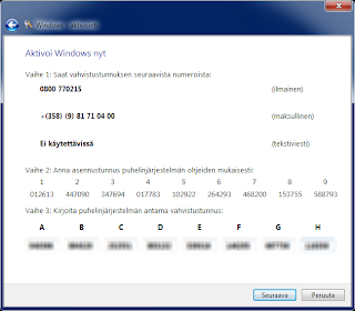
Unless you come to these dialog boxes, with authentication:


"Valinnainan" in the title is a typo (correct form is "Valinnainen"). This is sadly hilarious, because it makes the whole dialog look like a poor-mans trojan software, with bad Finnish. But this is authentic. Sigh.

Maybe there comes a time when pirated software has better localization than Redmond-based. Wouldn't be hard. :!


Nothing wrong with this.


Afghanistan?

We're running *Finnish* localized Windows, and this is the best guess for where I might be? *sigh^2*


This dialog is what one sees when *calling* an automated robot lady at Microsoft, to get magic numbers that make the Windows behave like it's genuine (which it is). I hope I never need to do that again.


Finally, hey we're there!  Activated Genuine Windows 7. Cool. :)

The reason for all this was that I use Windows 7 Home Premium via Bootcamp, but also under VMWare (from the Bootcamp partition). A usage case that works, but confuses every authenticity scheme I know of (well, Windows and Autodesk, but that's enough).

Somehow I have the feeling that using a pirated Windows 7 might let me through with *less* typos, *less* phone calls and ... never mind.

Saturday, September 24, 2011

How to Tweet (always in progress)

Disclaimer: I will keep editing this blog entry when I find good (or: bad) samples that highlight a particular point. You can participate by tipping me on such at bmdesignhki. Thanks.

Edit 2-Jul-2013: Now, after almost 2 years, I seem to disagree with some of my original points. That happens. :) Will make some commentary today below (this is connected to asking @tuomasenbuske and @alexstubb to visit here connected to their #twitterkirja project).
---

Twitter is gorgeous, and I plan to use it in business extensively (already do). But many people use it 'wrong', mostly unknowingly. Every means of communications has also an informal 'protocol', whose intention is to make the communication more efficient. This also probably is the underlying rule in this blog entry: make digesting your tweets easier. Make them short, and catchy. Do some work for the reader (not the other way round).

First of all, Twitter is like swimming. It's easy and natural once you're there. It may be hard to explain. You should not use Twitter (to make your own tweets) half-heartedly, as most organisations nowadays do. Do it all, or keep out. Like with swimming.

When starting, I found The Simple Twitter Book by BrentO very useful. It describes the basics (s.a. what is a re-tweet, hashtag etc.) and how to use Twitter from a business angle. Read it.

#1 Don't use hashtags within a message (only at the end)

Jul-2013 :
I now regret this first entry. Maybe it's the learning curve. Hashtags within message body are okay, but don't overuse them. They are similar to using bold in documents, since they are normally rendered in a different color (this also has to do with why overuse is so tedious). 

One way a hashtag helps the reader is it allows a one-click route to see more about the particular subject. It also brings more readers to find your tweet in the first place (i.e. I currently use the #scala hashtag a lot). For this sake it's good to use rather established tags (they're somewhat akin to ad-hoc mailing lists, really). Sometimes, to make a point, you can make a whole unique #iwouldntcareless kind of tag. For fun. :) 

Hashtags are cool, but I find them disturbing when being injected within the message body. Twitter messages are supposed to be glanced at once, and those hashes simply ... don't do no good.

Use hashtags at the end of messages only.

Bad example:

Here @rmchase (whom I deeply admire - sorry for needing to use you as a bad example) uses #bikesharing instead of just writing "Largest bike sharing in the world". Also, note that the #buzzcarFR is actually completely unrelated to this tweet (so I removed it when making my own retweet):


Good example:

     (to be added, please suggest one. Something that has relevant hashtags in the end - and a readable, catchy message body.)

#2 Don't use integrated tools (they suck)

These days, many sites suggest they could do your tweeting for you. Don't trust that. They will simply clutter your timeline with automated-looking unworthy tweets that cause people to lose interest in you.

Also, use of "Twitter integration" may cause situations where the same message ends up through multiple channels on your Twitter feed (see below).

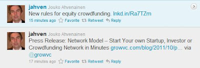
Bad example:


Here, the tweets look different and I actually clicked both links. But they are the same! What I figure has happened is that the user has created a hand-made tweet in twitter ("17 minutes ago") and also entered a note on LinkedIn, but with completely different title ("15 minutes ago"). LinkedIn uses their interim URL scheme to know who pressed what and when (thus the "lnkd.in/...") but leads one to the same page.

The user might not even realize that this happens. He has simply thought that making LinkedIn updates automatically show up also elsewhere is a good thing. It is not (unless you are aware of it - and rely on it completely).

Good example:


Actually, the exact same (original) tweet serves as a good example. This looks like something carefully crafted for Twitter viewers only. It is easy for the reader and contains all relevant information. It is easy to decide whether I want to click the link or not, and 'via @growvc' gives appropriate credit to the tweet flow.


#3 Don't use multiple links in one tweet

Tweets are supposed to be simple. Putting two URL's is technically possible, but troubling for the reader. If interested in the tweet, which one to push. Both? One of the main benefits of twitter is the shortness of messages; the author is supposed to take care in making the message clear and easily congestible. Do it. Take time. You decide which URL is the best.

Often, this happens because of "integrated tools". Facebook places the original (good) link on the tweet but insists on placing its own (to track, I don't know what) as well. Actually, both of these may lead to the same final page, which is even more annoying for the reader.

Bad example:


Note the two links, both leading to the same page. Also note "via Facebook"


#4 Don't use interim pages

Twitter is supposed to be simple. Straightforward. Fast. Don't annoy your readers by making a tweet that does not take people to the particular page, but some interim page where they must again look for the right link. This is misusing Twitter, and comparable to email spamming.

My friend prtguru does this all the time. I haven't had the guts to tell him (but - please do).

Bad example:


All his tweets lead to the same page, http://www.prtconsulting.com/news.html. From there, I will need to re-search the particular news entry that I was actually going for.

Even worse, since the news page is often updated, older tweets (that may get new publicity by re-tweets months after their original exposure) will lead to the general link page, covered by more recent entries. This really sucks, from a Tweet reader's point of view.

Correct action is to always use links taking directly to the particular page, links that will remain valid as long as possible (at least some 2-4 months).

Jul-2013: Peter now seems to give links to particular news pages, which is good for both him and his readers.

#5 Mark videos, especially if needing flash

If you're linking to stuff other than a usual web article, say so.

Add "(pdf)", "(pdf 6MB)", "(video)", "(flash)" or similar to the tweet, just prior to the URL. Many people (s.a. myself) read tweets over mobile connection and for such tweets, we'd rather collect them and see at home.

Bad example:

(some tweet that links to a Flash-only site or video, without saying. Completely unusable on an iPhone / iPad)

Jul-2013: In the two years, mobile rates have gotten cheaper. What I've grown to do in my own video tweets is to mark i.e. "(2:30)" for a 2,5 minutes video clip. Twitter clients nowadays show previews of i.e. Youtube links automatically, but it's neat to be able to see the duration of such link. This helps the reader to know how much of time they may be committing if clicking the video icon. 


Good example:

(some tweet to a video with time quoted)

#6 Mark interests other than what your subscribers expect, with hashtags

My followers are probably interested in urban design, cleantech and ecological issues. Anything else may be considered as noise by them, and causing too much noise is a sure way to get unfollows. 

Still, occasionally I want to tweet on other things, but I try to mark them as such.

Example:


With this one I was cautious anyways. It's a link to an online petition to call action against shark fin usage - fishery that casts whole shark bodies back to water after the fin has been cut off. They cannot swim that way, and slowly die. I find this shameful for humans, and though a petition does little, it's something. To highlight it's not the usual stuff I tweet, I added '#wildlife'. Could have added '#petition' as well, though it's mentioned in the body.

#7 Be consistent with the language

Many people (s.a. myself) tweet in multiple languages. Since tweets are anyways short, it is unnecessary to burden them with a further remark on which language is being used. Just be consistent. If the link you're referring to is in Finnish, tweet in Finnish. Giving the headline in English won't help your English readers get anything much out of the article behind the link.

btw, it wouldn't be a bad idea for Twitter to somehow (automatically?) find out the language used in tweets, so English readers could i.e. opt out of my non-English tweets. @feedback

Jul 2013: Twitter recently introduced Bing translations of tweets (not available in most clients though). This allows anyone to at least get a clue on what the tweet is about. Good feature (I've used it for Arabic-Finnish translations a couple of times).

Bad example:


Ville's tweet starts with English, says "This looks interesting...", but links to a Finnish page and finally apologises of the language (but at that point, it's too late!).


#8 Have a rhythm

Like in poetry (because it's short) also in tweets rhythm matters. It makes an extra caking on the subject. How you present is important.

Bad example:


This is obviously from an automated delivery "tube" (see point 2, "integrated tools") which destroys much of Sitra's often otherwise relevant tweets.

Also, look at it.

   "Sitra.fi renewal:" 

This is completely unnecessary - what added value does it bring? (I only later realized the tweet was actually about revamping their website. Good - it says so in the front but "renewal" lead me to think of internal organisational renewal instead.)

   "Kill your design-darlings:"

Hmm - okay, we are getting to the essence?

   "Art Director (definition):"

Third prelude ending in a colon. Nothing, yet.

   "Person with superior vision of design..."

Now, it seems they ran out of 140 characters, so the integrated "tube" cut the message short. What's the point? This tweet is unnecessary, and it's making the brand of Sitra look bad online. Like most of their other integrated tweets.

Let's see how to say the same with rhythm.

  "Revelations re-designing sitra.fi: early feedback and content are king(s). <link>"

That's probably not the best, but it does tell what the story is about. I would still say it lacks rhythm (it's too long). The "(s)" at the end tries to be funny.

(a good example on rhythm here, some day)


#9 Remove extra parameters from Youtube URL's

Be careful when copy-pasting URLs to Youtube videos. Depending on how you came to the clip, they may have unwanted parameters.

   &at=...

This parameter starts viewing the video from a certain place. Usually, you want to remove it so people will get to see the entire clip.

   &feature=player_embedded 

You can remove this one as well.


Jul-2013: This happens a LOT. People simply don't realize it and actually - Twitter could automatically cut out many parameters without damaging content. I think they should. @feedback


#10 Always check your URL's after the tweet. Always.

It's very easy to post tweets that have a completely wrong URL (copy-pasting error) or have a dysfunctional, partial URL. One that I came across recently (now deleted so no snapshot of that) pointed to http://china. Obviously, no such thing - it was supposed to point to http://ourworld.unu.edu/en/chinas-green-economist-stirring-a-shift-away-from-gdp .

Tools automatically shorten URL's so spotting these things while you are forming the tweet is no longer obvious. Remember you can always delete a tweet and repost it (there could actually be a 'modify' function in Twitter that would take the existing tweet contents as a template, while deleting the old one, atomically).

(example of a tweet with broken URL)

#11 Use hashtags when sidelining off your usual track

July 2013: this seems to be a duplicate of #6. Sorry.

Hashtags (words #likethis within your tweet) are originally meant for helping the search of content within all tweets in the world. However, you can also help the reader categorize a tweet using them, especially if you are tweeting of something outside your normal focus.

I use i.e. #entertainment, #movies, #ads etc. to tag my tweets that would be outside my normal contents (which would be transport, computers, technology - those I do not tag since people following me are probably expecting such content anyways, and unnecessary tags are a chore).

Like this, today:


What this hopefully does for the reader is to make it faster clear for him/her whether they are interested in the subject. Speeds up filtering (which is *vital* for tweets).

What this does for oneself is it avoids the danger of dropping followers because of sidelining to something that they would normally not be expecting. You don't want unfollows, right. 

#12 No commas between hashtags, please.

Hastags don't need commas as separator.


They should have simply said: #startup #entrepreneur #vc #networking

Another issue altogether is that the "Going the SaaS Route" is a very vague, and bad tweet to begin with. It is not self-consistent. It does not carry enough information to make me know whether I want to click the link or not. It makes me confused, and wastes my time.

Something better could have been:

   "Things to consider about going SaaS (software-as-a-service)."

However, the blog entry itself is rather vague, and a good punch-line is hard to fine. Maybe it is only appropriate that a tweet leading to it would be vague as well. (Sorry, GrowVC - I do like you otherwise)


#13 Do NOT use automatic notifications

Twitter is NOT 4square. Your followers don't want automated announcements on where you are. We want your original ideas, clever tweets and well thought-out retweets. That's why we follow.

This is a problem if an otherwise worthy-to-follow tweeter enables some system to do things like this:


Don't.

Twitter clients (or Twitter itself) should also start having filters so we can filter these things out of our timeline. I would never ever want to see *any* tweet starting with "@someone is now departing". Ever.

Jul 2013: Or someone gymming. You should exercise for your own good. Don't boast it to the world. It's lame (me thinks). :)


#14 When 140 characters simply isn't enough - multipart tweets


This multi-part tweet from @Battlefield is actually pretty good. "(1 of more)" etc. ties them together. The problem naturally is that one must read them from bottom-up, but...  

Generally I would advice not to go multi-part, but if you absolutely must, this is the way. Well done, @Battlefield.


#15 "Like us" tweets

This one is interesting [July 2013: but luckily rare].


Now, why would anyone *not* want to preserve our oceans? Essentially the tweet is only asking to "RT us", akin to the Facebook "liking".

To my taste, this is cheap, and against the way Twitter is normally being used. This is exactly what keeps me away from Facebook. Companies coming to "social" communications easily fail to grasp the subtle yet vital differences between the way the different forums work. So this is Facebooking the Twitter.

It's not that bad. You can always unfollow. But it's likely not to get you the desired effect on Twitter. Do this on the Facebook side. We thank you. :)


#16 Twitter can take international alphabets - use them! 

I'm attending a seminar tomorrow. The name is "Varaslähtö" (early / false start in Finnish) but the arrangers are proposing the tag #varaslahto.

Why? No reason.

We're so used to cutting down on "umlauts" in emails and web addresses that this extends unknowingly also to Twitter. However, your tag can be in Arabic, Chinese, Japanese or whatever. Certainly Finnish.

So: #varaslähtö it should be. :)

http://www.sitra.fi/tapahtumat/2012/varaslahto-tulevaan


12-Nov-2012: #17 Know what the reader expects - don't give false expectations 

Like with any communication, set yourself in the role of your audience.

Getting this tweet:


..I was expecting to see the presentation. A video, at least some slides. There is a link, after all!

Nope. This was merely about such an event starting in a conference, around this time. How does this make me feel? Disappointed, since I would have wanted to see the stuff. Fooled, since I thought I would get somewhere (other than the program part of the conference). 

How does this make the sender and the re-tweeter seem to me? Like they fooled me, intentionally. Of course, they did not, but the emotional tag is already there.

Don't do this. If you retweet, check the links first. Don't give false expectations. If it's just the agenda, say so. This would provide the necessary info to the reader, and avoid them feeling fooled. 

Better yet, make a tweet when the thing is happening and another once (if) it is available for viewing onling. Thanks. 

Here's the agenda page the tweet pointed at:

http://devoxx.com/display/DV12/Building+Amazing+Applications+with+JavaFX


28-Dec-2012: #18 Don't dilute your tweets by flooding them 

Tweets are like little chirps of birds. One or two, now and then, is beautiful. Too much, too fast is NOT!


Any of these tweets might be important, but seeing them all at once, tweeted within roughly an hour (and there was more) makes them look garbage. It dilutes their value. Twitter is not a mailing list, it's a forum of serendipity. This is going against its stream.

This hurts the author of the tweets the most. You want your tweets to come out at nice times of the day, among other people's interesting tweets. This leads to people ignoring your messages, and worse, unfollowing. Stupid move.

To avoid this, there is i.e. the BufferApp that allows one to schedule tweets for later deliver. I'm not a huge fan of that app (since it kind of down-plays the serendipity factor, and allows i.e. concentrated efforts to catch the best twitter delivery times - well, to at least a certain time zone. also, it's amazingly complex.). Anyways, it's there and it will release one's flood syndrome.

Sorry, @mbauwens. I never read any of the tweets above. Had it been two, I would have. :)


2-Mar-2013: #19 Do NOT tweet the same stuff. Time flies - fly with it!

Check this tweet from @EV_Innovations:


 Nothing wrong with it, right? And there's not. Except... I had the feeling I had seen that before. Yep.


They only have three unique tweets in this whole time. I do get the idea behind this behaviour: by repeated tweeting newcomers will likely find information about them more likely. But they will not stick. What you want with Twitter is a community, a fellowship, who sticks with you, interacts with you, and promotes you further. This only manages to annoy such followers. You get quick turn-in, and quick turn-out.

Currently, @EV_Innovations has 581 followers. I don't call that success.

This kind of feels lame, and lazy for me. In Twitter, one should do one's best to spare the time of the followers - not your own time. This does exactly the opposite.


17-Jun-2013: #20 Be Relevant

Tweets from Eric Lowitt:


Eric should be able to use Twitter effectively. Collaboration is his thing, and he must spend a lot of time in social engagements. Why then does this not show on his twitter feed?

- there's never anything that's acutely happening Right Now (for which Twitter is the awesomest venue since tweets age in minutes).
- it feels like re-heated porridge from yesterday (that was re-heated from the day before..)
- it lacks person-to-person engagement
- it often lacks relevant links (to material other than his)

In short, it's like reading a mail order catalog. Not the best use of Twitter.

Eric - sorry. I didn't have the heart to send you a link. I'm a chicken. (on the bright side, no-one reads this blog so you're safe :) ).

...more entries may be added...


If you found this list to be valuable, please say so at @bmdesignhki. Thanks.

Tuesday, September 20, 2011

GPU makers are still not getting it! - way to 'retina' displays

http://www.appleinsider.com/articles/11/09/20/intels_ivy_bridge_support_for_4k_resolution_could_pave_way_for_retina_macs.html

There is a real need for 'retina' desktop monitors. Resolutions where we don't see individual pixels any more. I.e. the 27" Apple Cinema Display is otherwise brilliant, but reading text or even web pages on it is less than optimal. The pixels on such big screen become too big. Apple's laptops are way better in this regard.

But - it seems Intel would be going there with the traditional approach. Why?

We now have Thunderbolt. It's essentially a PCI bus over thin serial wire. So why not make the GPU *inside the display*. The distinction is not big for the consumer - they might not even be aware. The same cable. But instead of streaming each and every pixel across in such a GPU-within-display device the OS X display elements and commands would be sent. Like for text, the characters instead of the rendered bitmaps.

This also makes sense in other ways, especially when thinking of a small laptop + large stationary "office" display. Excess heat dissipation is easier in the display. One would get better graphics processing speed when working with the big screen. Why carry that GPU chip along in the laptop everywhere. Actually, latest Macbook Airs don't have a dedicated GPU. See - maybe Apple indeed is thinking this.

It is *so* obvious to me as a computer engineer that this is the way to go forward. Intel - please say this is what you have in mind. We don't need retina display support the old way.

Saturday, August 20, 2011

What makes a hotel green / hotels of the future?

http://eandt.theiet.org/magazine/2011/07/index.cfm

Coming to that article made me remember my last trip, to Cologne, and the decision to start using AirBNB instead of hotels.

What could hotels do to keep up in the competition?

  • Lend out jogging equipment
I wanted to go running in the morning (the hotel had awesome neighbourhood, including some Roman time water channels), but had left my running shorts back home (won't do that again).
Why cannot hotels lend out jogging shoes, shorts and t-shirts and then launder them after the job. No smelly clothes hanging in the hotel room. They wash bedclothes anyways, this wouldn't be so much different. I'd be happy for 7-8 eur, maybe even 10 added for this service. But I need to be able to count on it, ahead of trip (i.e. having the right shoe size available).

Why not do this? Because no-one seems to want it?

Go further. Lend out bicycles (some hotels undoubtably would already do so). Team up with a close by tennis court (which was there). Meet other hotel guests for a play of tennis. Neat.

Hotel chains must pump up their "activism" and "eco-friendliness" in such way.

In the US, one can add healthy breakfasts to the list. At least way back, it used to be sugar only. Naturally, someone should first instruct the Americans what healthy actually means. :)
  • Better booking, preferably a mobile app
Hotels must make finding the right stay as easy as AirBNB has done it. One of my favourites is the "I need the room THIS NIGHT" button topmost on the AirBNB user interface. Though I'd never actually use that button, simply having it there gives me confidence that I'm in good hands. Ever tried to find a hotel room for the next night? Might be a failing endeavour.
  • Get a face
Instead of call-in numbers and queueing, have a real person contactable over mobile chat, SMS or otherwise. Again, like AirBNB beautifully does.

So - in short I would argue future of hotels is already here. It's got a name and a business model. It's AirBNB.

Note: I wrote this before having taken a single trip with AirBNB, yet. I may change my mind.

Tuesday, August 9, 2011

The Blog that did not Let me in.

http://www.smartplanet.com/

It's a nice looking site. Great stuff, gorgeous layout.

Hey, I want to add a comment. Sign-in...? okay.

No Twitter integration. Dammit. Must use a lowsy pw. :/

And then this eternal loop, never ever getting me into actually giving the comments!


I tried with Safari 5, Firefox 5. Cleared cookies. Waited overnight. Sent a message to their support (no reply). I should have simply given up. :(

Anyways, here's what my comment would have been:


Not quite true..

Tesla is only one sample. A lot has changed in the auto industry since they started their development. Electricity has become the trend and everyone is planning for e-mobility. This brings part cost down and offers pieces "off-the-shelf" that earlier needed to be manufactured by particular car companies. In other words, car making has become modular in a way that happened to PC's in the 1980's and 90's.

Two sample cases. ERA, the Electric Race About X-prize contender, a project built by a team of Finnish students. Magnificient car. Budget? 1 million euros (half of that goes to the special battery). Wheel engines. Gorgeous drivability. If you them 1 million, they have promised to build you one. That's. not. really. much.

Gordon Murray Design (UK), and their T.27. Gordon Murray does not make cars. They make car factories. But to show the point, they also made this car. Very safe. Gorgeous design (at least me thinks). You can fit two of these, next to each other on a regular lane (= bypassing doesn't need lane change). Three fits in one parking box. Time it took them? Around 1 year.

And then there's this thing. PRT transportation that is like electric car, only grade-separated and automated. Really, these things are technically as easy to do as golf carts.

So with these cases (and some others not listed) I dare to say Tesla looks rather oldish, and there indeed is innovation in the air when it comes to transport. Wether we get new stuff actually on the road fast enough is another matter. Investments will help. They don't have to be in the billions. 10M is great for any of the projects above!

- asko


Saturday, August 6, 2011

Suggestion to Safari (and other browsers) - viewing pages from cache


If Internet connection is down, but Safari has the requested HTML in its cache, instead of showing "Network diagnostics" button it could also show "Show from cache". This would allow returning to a page one recently viewed.

I'm visiting India, and we just had an electric blackout. I would have wanted to carry on reading the economist page I had open earlier. History still has it, but there's no way in Safari to read the cache copy instead of the online.

The same issue also happens if you are travelling, and don't have wlan connection. Ability to browse the sites kept in cache would sometimes make the difference in finding crucial information or not.

Friday, August 5, 2011

We have a problem - fitting PRT to India


We have a problem.

I have a startup for making light weight PRT transportation, and India is supposed to be a main market. Today, when walking the streets in Mangalore, I realized the solution won't fit for two reasons.

( A little disclaimer first: Mangalore is not really suffering from too much urban growth or traffic congestion. Currently, it is not in a need of PRT. But some parts of India (i.e. Bangalore) desperately are and these issues might abound there as well. )

#1 - Electric wires *everywhere* in the air
We cannot think of putting traffic at 3,5m if there are electric wires at 5. This sometimes occurs is western cities as well, but much, much less since there cables are more underground. I.e. city lighting is done with underground cables.

#2 - Movement patterns are different
We have been riding around the center with rickshaw. The problem is that at least in Mangalore, there are no suburbs or other "natural areas of movement", as I like to call them. No "city within city" but in order to get stuff and go places, people travel here and there, seemingly randomly. I guess the lack of city planning has caused this. Anyways, it's a fact. No suburbs.

That means two things: gradual introduction of PRT is a doomed idea. In order for a system to be usable, it must reach places. A track covering some particular part of a homogenous city is useless.

Second, an introduction to a whole city (which I think is utopian anyways) would cause major havoc among rickshaw drivers and others losing their livelyhood. Not so with gradual introduction (if that were possible) since the drivers could continue business nearby.

Solution?

I cannot see a solution to these issues, which is okay in itself. PRT should not be pushed into places where it does not fit, or brings little additional value. We must be careful with that once the hype stage of these tracks comes - it is a disgrace if they end up destroying local life instead of enforcing it.

The air wires probably will be put into cables eventually - at least that is what happened in the west. Maybe in a monsoon climate it's actually better to have wires in the air?

At least in bigger cities, rich people are getting their own "suburbs", but they are not large enough for an internal transport network. And for such rich people walking wouldn't normally hurt. The idea of a PRT track connecting such apartment islands with selected malls and selected workplace feels like a disgrace as well.

If you have a solution to this, please comment or send a tweet to @bmdesignhki.

Thanks. 

Sunday, July 10, 2011

What does 3D printing and exploration of Moon have in common?

A lot.

There's a second Moon race going on, among (at least) China, Russia, India, and EU. But the whole concept of getting "man" back to the Moon has kept me thinking. Isn't it an era already where robots can be doing much more, and much cheaper. I think so.


Now, the work robots should be doing on the Moon is for example Helium-3 extraction (see for example this documentary for "why?"). So how to do that?

Machines that build machines

That is precisely what 3D printers are, and based on this video plain desert sand will do as a raw material.


Now, instead of sending dedicated Helium-3 harvesting machines from here to the Moon, figure out a way to harness the solar power to build those machines in-situ - and download the blueprints.

Heck - once "factories" (ehem - regolith-printers) are up and running, one can even download new build instructions to them. Have all the necessary parts waiting for you, on Lunar surface, when the people arrive. And only the printer needed to be sent.

Beautiful, isn't it?  :)

With this approach, multiple factory sites can be established in different maturity levels. Some would enter production while others would be only "seeded". Exploration of the Moon becomes akin to gardening.

...and the year is?  That depends on us. Progress is not something that happens by stating a year. It needs a lot of hard work to proceed. All I'm saying is that hard work would better be used on 3D lunar printing experiments. With or without human involvement in the picture.

-asko


Saturday, July 2, 2011

What happened to the West (too much security blocking our spirit)?

I noticed this advertisement in Bloomberg Businessweek today:


Reminds us of this iconic picture of construction of the Empire State Building:


Now - what happened. Work security happened. Less workers needed happened. But... did also stagnation happen?

Is it because of the safety equipment, both seen and unseen that the current western societies have lost their agility and - partly - their innovation.

Then there's a third picture playing with this theme on the internet:


Since human life is so precious (it costs companies to lose lives, otherwise they might not bother more than before) should test dummies build the skyscrapers?

I'll leave it here. Don't have answers but I think the one-man-in-harness is a lousy picture for an add. To me, it underlines inefficiencies and structural limitations. How on Earth is the guy supposed to move up there! The harness will kill him!

Maybe that is exactly what is happening for us in the West (Greece, USA, UK, Finland). Harness limiting and killing us. Slowly but steadily.

Wednesday, June 29, 2011

Twitter: give "RT" references "for free" (suggestion)

There's been pleeeenty of discussion on the internet about the way Twitter is subtly changing its mechanisms (regarding retweets) but with not-so-subtle consequences. In short, I feel the current situation is a bit crooked, and at fault.

Short summary of current situation:

- you can either do "official" retweet which means the original tweet is unmodified and shows with the original tweeter's icon, but also to your followers. Essentially, you're giving the tweet more publicity.

This is good, but it lacks making even trivial corrections (s.a. fixing typos or formatting, or making the tweet slightly easier for the readers). Often, such changes are desirable.

So you have the "unofficial" RT characters. Mark "RT @someone" anywhere in a tweet and it's taken that this is a retweet (maybe edited) from that user. The new tweet will show under your "colors" at your followers only, like it came from you (which it did). The "RT" is just a social convention, though some (non-official) tools happily support it.

I like both. They serve different uses.

Now, let's take this tweet today from @TheEconomist.

: A Greek entrepreneur discusses the difficulties of doing business in the country due to bureaucracy

I like a different way of highlighting there's audio involved. Not at the very front, but subtly just before the link. Also, I like to inform readers if flash is required (which it is for the link above). So:

A Greek entrepreneur discusses the difficulties of doing business in the country due to bureaucracy. (flash audio)  RT @TheEconomist

That's it - and send. No - you cannot. Too many characters.

I could send it without the "RT" part but that's kind of stupid. I want to give @TheEconomist the glory. Worse still, if someone re-retweets this (the "RT way") she'd be adding my twitter id at the end, "@bmdesignhki". Now we're truly out of the 140 character bounds. This is very known problem.

The cure

What if any "RT @someone @another" mentions in tweets would be handled not as part of the 140 characters but "free", as metadata of the tweet. Twitter could do this. The implications would be:

- Allowing any tweet to be RT'ed any number of times, without bothering people with the 140 char limit
- Settling the official/unofficial retweet discussion. Hopefully.

The user experience would not really change at all (at least, not for worse). Any "RT" tweet would be shown in *my* colors, so that I cannot mess with the reputation of someone else, by malign modifications or fakes of their tweets. I guess this is behind the official policy of unmodified-retweets-only.

Better still, Twitter could actually link metadata to the earlier tweets this one was based upon (as a chain), not only the twitter id's. This way, I could "wind back" to earlier tweets if needed (s.a. the @TheEconomist original).

In short, I see this pretty easy to do. It's more of a political issue than technical, most likely. Please - do it.

If Apple was Twitter, they'd do this. :)  Give us modifiable retweets Done Right.

Addendum

Actually, give also '#tags' free of char-charge. In other words both retweeted id's and tags of a tweet (especially if at the end of a tweet) should be freely addable. If someone tweets a full 140-char masterpiece, I can then "RT" it but also add tags of my liking - i.e. "#masterpiece" - to it. The only place where the 140 char limit really stands on my way is these two issues.

Should be easy to fix, right? :)