Saturday, February 25, 2012

My list for the next XBox...

Microsoft seems to be making an "XBox 720" console, with the usual "better graphics blah blah" specs. That's great. We can do with a GPU upgrade, more RAM etc. They'll get all those wishes from the game developers.

Here's something to add to that basket, from a game (casual) end user.

- support for two monitors

Yes. Two HDMI ports. Would be awesome for games s.a. SSX snowboarding, or racing games. Instead of split screen, give each player a full high-res screen! Even for shoot ups s.a. Battlefield this would allow wider view angle.

Since current PC-level CPU's are anyways (I presume) ready for multiple monitor support, this wouldn't be such an over-the-top requirement. Most likely, it'll already be on the silicon that Microsoft works with. Just don't disable it. Use it.

When used for dual player mode (i.e. SSX or car games) each HDMI could carry their own audio, as well. This allows (maybe with earphones) to hear your own stuff.

This may sound like "really, that's the last thing this world needs". And maybe so. But at the same time, playing in company and against a human opponent is incredibly much fun! Almost all of my NHL (2008, I confess!) gaming is like that. There dual screen mode is not badly needed, since there's only one puck. With SSX and car games, splitting the screen literally takes half the fun out!

Some more things:

- get rid of the DVD. I trust you will (it's slow, noisy and... simply old-fashioned). Downloaded content of games on standard (non-writable) USB sticks.

Addendum:

Tietokone has an article today: http://www.tietokone.fi/uutiset/seuraava_xbox_ei_levyasemaa_myyntiin_ensi_vuonna

- no physical disk drive. Check.
- games will be sold on little memory cards. Hmm... okay, just make it a real USB dongle, like Autodesk does.

What they really should do is:
- make a good local caching thing (with unlimited storage on the Cloud). One can install *any*number of games, the ones not being used lately can get removed and can be re-fetched from the Cloud. All this seamlessly. Plus ability to change the local cache disk, without as much hassle as there currently is. Just disk out, disk in. If the Cloud has the primary copy, the local disk is nothing but a cache (unless you're being offline).

- Finally, smooth integration of Zune (or whatever videos are called) with XBox dashboard. Still not there. Microsoft internal organizational glitches show all over the final UI. Why don't they learn. Why?

- Bring text input to the 21st century. Actually, let me show the secret key codes (of so many games nowadays) to the Kinect camera, instead of typing them in. Have some overall thinking!

Addendum II:

Another rumor, via Finnish Pelaajalehti.com: http://www.pelaajalehti.com/uutiset/huhu-uusi-xbox-vaatii-jatkuvan-nettiyhteyden

The graphics arrangement looks promisingly capable of two-monitor usage (I hope MS is really checking this option out!). I'd leave the Blu-Ray out, or at least make it optional. With a fast network connection, who needs it (and MS would make more money selling *all* games downloadable, anyways). If they need physical media, non-writable USB sticks are *way* better for everyone (maybe USB 3.0 so even read times are blazingly fast).

Addendum III:

Power hungry. Not.

The current XBox 360's drain something in the neighborhood of 150W when playing a game. Older models probably more. And this is without the tv.

Now, an Apple TV (2nd generation) drains 6W.

See the difference? Now, *what if* the Apple TV system-on-chip actually gets good enough to run Xbox 360 level graphics. It can. That's a 20-fold difference in power consumption!

So, if I were Microsoft I would be highly concerned with the power envelope of the new (if ever) XBox 720. It's not only the features. Cut down the moving parts (no DVD, hard disk etc.). Cut down the size. Cut down the power need. Try to get close to the Apple TV while still being a great ass-kicking game machine.

Actually.

Make an XBox almost as small as the Apple TV. With Kinect. With existing XBox 360 features only.

Then make the "XBox 720" with upgraded performance, but only about twice the size and power envelope of the little brother. Continue selling both. Kinect games are fine with the existing graphics.

Saturday, January 28, 2012

My wish list for the next iPhone

There's some rumors on the net about what the iPhone 5 would be like.

- bigger screen (5")
- quad-core A6 processor
- 4G and LTE network support

Now, let me give a single 3GS model user's point of view of what I'd like to have.

The bigger screen sounds good. Since buying the iPhone my phone usage has transformed. It's mainly my Twitter machine, then email, then SMS, then phone. Really - using it as a phone is ... well ... getting less important all the time. But of course the phone functionality must be there, and be there flawless. But I'm not keen on the network specifics, as long as they work.

One *definite* killer version would be this:

- free Twitter roaming around the world

The way I realize I'm "back home" again after a travel is that I can tweet naturally. Whenever. Using 3G. This I cannot do on trips and... it's weird. This and the inability to use Google maps (unless I've been smart to preload the particular maps before the trip) is what bugs me the most. Don't bother with 4G/LTE unless there would be a decent global data roaming (hey - I'm fine with 64k speeds abroad!) that would not cost incredibly.

Doing this would make it feel like a world phone (ehem - I mean tweet unit).

Quad core. Nah. Details. Three would be fine but if four is easier to do, whatever. :)

One more thing.

Hopefully, the enclosure changes. Either to full aluminum (no you wouldn't do that, it's already passé and it scratches easily and feels cold in freezing temperatures). Go with carbon fibre, or any composite!

Be it "thermal plastics" or "nanocellulose", figure out the light and sturdy construction that will make us go "ooooooh" in awe. Do it One More Time.

Carbon covers simply look brilliant, they feel sturdy and nice, and they have somehow a "natural" feel to them. Go Green, Apple!

http://puremetalcards.com/blog/tag/carbon-fiber/


FastCoExist: Apple patent foresees sexy, bullet-proof iPhone


Tuesday, January 17, 2012

3T-lehden analyysi

(This is a Finnish piece, discussing the demise of an esteemed Prosessori magazine and the 'properties' of the 3T weekly technical newspaper supposed to be taking on its readership.)

Vuoden vaihteessa saimme jättää hyvästit Prosessori-lehdelle ja tilalle alkaa tulla 3T (teknologia, talous, työelämä).

Sinänsä vaihto voi olla ihan perusteltu, ja painotus pelkän tekniikan rinnalla myös talouteen ja työelämään on ihan jes. Mutta saatuani ensimmäisen 3T-lehden luukusta tunnelmat olivat ristiriitaiset. Paksu nivaska, Prosessoria tuplasti isompi (A3) koko, mutta... oliko pelkkää höttöä sisältä.

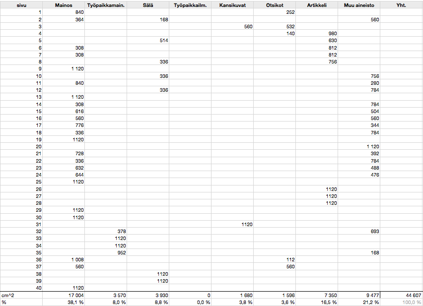
Tein analyysin lehden 40 sivusta päästäkseni selville, mistä epäselvyys ja sekava tunne johtui. Sillä "sekava" lienee juuri paras sana kuvaamaan tätä ensimmäistä lehteä. Osin se on kuin Prosessori (itse artikkeli oli hyvä - siis se yksi!). Isolta osin se koettaa olla jotain Tiede-lehden (sen huonomman) kaltaista. Laitoin nuo jutut analyysisarakkeeseen "sälä". Kansikuvia on ainakin kaksi, mutta itse lehden etukansi on uhrattu mainokselle. Niin myös iso osa sen sisemmästä pinta-alasta, ripottaen sinne tänne niin että itse asiaa joutuu etsimään.

Mielestäni nuo kaikki osattiin Prosessorissa paremmin. Mainoksia saa olla - ne ovat osin hyödyllisiä - mutta ne kannattaa pitää erillään tekstiaineistosta. Prosessoria ei tehnyt mieli laittaa paperinkeräykseen, mutta tämän lehden kohdalla sitä ongelmaa ei ole. Ei jää ikävä, eikä etsi "sitä juttua" jälkikäteen.

Koettaako 3T olla juuri tuota? Ohimenevää surffausta tämän hetken "tekniikan, talouden ja työelämän" aallon harjalla. Senkin voisi tehdä Tyylillä, vertailukohtana esim. joku The Economist, joka on sekä ajankohtainen, hyvin taitettu että täyttä asiaa. Toivottavasti 3T ottaa opiksi, tai perun tilauksen ja alan kirjoittaa lehden nimen pienellä t:llä, jos joskus on tarvis.

Tässä se analyysi:


Mainoksia on eniten, 38,1% ja yhdessä työpaikkamainosten kanssa miltei puolet lehden pinta-alasta (46,1%).

Sälää on 8,8%. Tämä on pieniä "tietoiskumaisia" irtotietoja, joita luullakseni Prosessorin lukijakunta kohtelee lähinnä kohinana. Eli signaali/kohinasuhde laskee näiden takia - POIS!

Kansikuviin ja otsikoihin menee yhteensä 7,4%. Ihan hyvä, mutta laittaisin lehden KANTEEN kansikuvan, eikä mainoksen. Vain Turun Sanomissa on kannessa mainos, ja se ei ole hyvä referenssi!

Takakannen voisi käyttää säläkokoelmaan, jos sellainen nyt oikeasti pitää jossain olla.

Itse artikkelien - otin tähän kaiken sellaisen, mikä liittyy lehden TTT-asiaan ja joka oli yhtä palstaa pitempi juttu - määrää saisi ainakin tuplata, ehkä triplata. Nyt artikkeleita on vaivaiset 16,5% lehden paperialasta, ja pienempien "muu aineisto" -juttujen kanssakin (sellaisia yhden, kahden palstan pätkiä) 21,2%. Signaali/kohina suhde jää kaikkineensa huonoksi, 45:55 jos kansikuvat ja otsikotkin lasketaan "signaaliksi".

Aion seurata 3T:n signaali/kohinasuhteen kehittymistä parin numeron ajan, ennen kuin teen lopullisen päätökseni. Sille yhden artikkelin tekijälle (Anna Ruohonen, "Palvelukseen halutaan superinssi") kiitos - ilman tuota juttua lehdestä ei olisi jäänyt käteen mitään ja olisin tilauksen jo peruuttanut. Toivottavasti seuraavasta 3T:stä löytyy jo pari vastaavan tasoista asia-artikkelia!

3T netissä

Lehti pyrkii selvästi olemaan sekä paperi- että online-julkaisu. Jälleen... peräänkuuluttaisin sitä Tyyliä neljänneksi T:ksi noiden kolmen rinnalle:


Jopa enemmän sekava kuin paperilehti.

Neljä saraketta. Enemmän ei todellakaan ole parempi, mitä tulee nettijulkaisuihin.

Saanko tilaajana poistettua mainokset näkyvistä kokonaan? Ainakin tuon oikean sarakkeen?

Vasemman sarakkeen striimin näen kuitenkin myös Twitterissä. POIS.

Jälleen sama kuin paperilehdessä: enemmän tilaa itse jutuille, ennen tuota "Lue lisää"-linkkiä.

...ja sivun pohjalta löytyy näytön verran ja yli lopputekstejä, tarpeettomia linkkejä ja mainoksia Sanoman omiin muihin julkaisuihin (sisäsiittoisuus ei ole cool; laittaisin nuo linkit pienemmälle!)

Tällä kaikella pyrittäneen mainostulojen maksimointiin. En usko, että se siihen johtaa.

3T-lehden veppisivun "alaviitteet". :)

Palaan asiaan parin numeron päästä, n. 27.1.

Saturday, January 14, 2012

Making interim commits in git

I'm reading the Git Book and wondering about a habit that I have in using version control (so far, subversion).

I like to make commits only for working, at least compiling, stuff. But I also want to make them as "fallbacks" in the middle of bigger changes, in case things start going in a bad direction. In svn, I mark these commits as "interim" by their comment.

That works well with subversion. The commits end up in the repository, but there's no real harm in that. Svn stores deltas, so there will be the changes from A to interim (to 2nd interim, ...) to B. Not much different from having changes directly from A to B. No downside.

Git, however, stores the whole binary "blob" of a file in a commit. Anything that's changed. Moreover, I wouldn't really even want to get the interim commits all the way to the repo. I would simply want to have a temporary "level of undo" where I can fall back.

I will now keep an eye open for a solution using git that would allow this. Something like:

- start working on new change
- make "interim" commits
- once ready (things compile, and run, and the undos won't be required): purge the interim commits
- make one real commit that contains all the changes (A to B)
- git push

If anyone already knows how to do this, I'd be interested. If not, I will try to figure it out.

If it *cannot* be done with git, I think the system would benefit of such an addition (ability to merge commits that haven't been pushed into a single one, removing the blobs that aren't being referred to any more after the merge).

-asko

Tuesday, December 6, 2011

When companies are ssssshhhhh quiet.

I've got a Logitech DiNovo Mac keyboard, and I'm actually very pleased with it.


Except that while there's Logitech software for this keyboard on Mac OS X, and Logitech software for their other keyboards on Windows, there's absolutely nothing for using this - the Mac edition - on Windows.

Now, people are mixed users these days. We have Macs with BootCamp and we do occasionally run Windows on these machines. What does Logitech do about this?

(...listening...)

They don't seem to even recognize the issue. This describes half of the issue, on Logitech's own user forum:
http://forums.logitech.com/t5/Keyboard-and-Keyboard-Mice/Use-of-F1-F12-with-DiNovo-Mac-Edition-under-bootcamp/m-p/389994

Can companies still do this, at the Age of Twitter? Seems they can. :(

What I would appreciate of Logitech is to acknowledge the situation and say whether they think they'll be doing anything about it. They *certainly* have the software knowledge to get the bells-and-whistles (volume keys would be nice, and the Fx-key issue described above) to fix this. They do Windows software. The functionality could be part of their normal (next version) Windows tools, simply supporting also the Mac variant of the keyboards.

But do they say anything?  Nope.

Sorry, Logitech. I like your mice and your keyboards, but... your customer (lack of) support sucks.
Please prove me wrong! :)
I've got Setpoint 6.32 installed on the Windows system. All it seems to provide is this dialog (no settings for controlling the Function and sound keys):

Also Apple Support Communities has a similar, fruitless call for help.

Note: Users of the Logitech Dinovo Edge Mac edition (which is a separate product, with embedded touchpad) are running to similar issues. They also have keyboard setup issues, which I don't recall ever having had. Anyways, Logitech naturally should extend SetPoint to deal with their keyboards as well, in BootCamp.

For comparison with my SetPoint dialog (that only has the 'Tools' tab), here is how SetPoint looks if there is a supported keyboard (and mouse) connected:


Saturday, October 22, 2011

Making narrative videos based on Keynote could be easier

( This is a copy of a feedback I sent to Apple's Keynote team. )

<<
I love Keynote - you've gradually developed it into a very versatile and nice tool, for making in-person presentations.

However, where I feel it can be improved is making narrative "taped" presentations. I have done such recently using a combination of Keynote, Garageband and iMovie, and the experience left me feeling like swimming upstream. The workflow was clumsy and making changes to a certain slide's audio was elaborate. Doing the same completely within Keynote would be ideal.

Keynote has basic narration recording and slide synchronization already (see here). However, the approach seems to suffer from some UI confusion and lack of suitability to at least my usage case.

The UI terminology is not very clear. 

Here is the current menu structure:


This kludges together both the narrative part and rehearsal, which are actually two unrelated things. Top three entries are for making narrative presentations. The two lowermost are for exercising live presentations.

My suggestion for the same menu:

   Play
      > Play with narrative
      > Record narrative
      > Clear narrative
      ---
      > Rehearse slideshow
      > Customize presenter display...

This way, one would use the word "narrative" for a recorded slideshow, with audio, and the word "slideshow" for any kind of general reference (s.a. rehearsing your live presentation).

The use of "Play" as the main menu name can be argued, since it also covers recording and rehearsal. "Studio" might actually be equally good? :)

The workflow seems wrong.

"Record slideshow" has following options:


The "Record from beginning" moves to the first slide of narrative and begins a whole new sound track for all the slides. The "Record & Replace" (or "Record & Append" in some cases) stays on current slide and replaces the soundtrack for this (and subsequent) slides.

This works for ad-hoc narratives where the person casually goes through all the slides in order. It fails on narratives with planned text to read, where getting one slide right at a time is already a good bite.

My suggestion:

Get completely rid of the options dialog. Take people directly to recording stage, but in paused mode so they can start when ready. If they remain within the particular slide and end the recording by pressing ESC, replace only that slide's recording. If they proceed to following slide, replace the recording of that slide as well.

I believe this change is great since it cuts away a whole (unnecessary) dialog, and suits both the old and the new usage case. If one wants to narrate the whole slideshow at once, simply go to first page, start recording and proceed through all the pages. But it also allows to go back to certain page later, and re-record only that one. Without scrapping the audio of the slides behind it.

Going further

You could make a little (loudspeaker icon) icon by the slides in the Slides pane to show which ones have a narration attached to them and which not. Pressing that icon could play the narration without necessarily moving to that slide. Currently, such features are in the Document level in the Inspector - again highlighting the idea that narration would be an undivided, document centric thing. It actually is a the opposite - a page-specific thing that gets bound together just as slides get bound together when running them as a slideshow.

I believe this misconception is underlying all the problems I'm facing with the current narrative Keynote features. Fix that, and all will drop in place.

I believe these issues are easy to fix and look forward to that happening. 

Here is my current narrated presentation I did using the painful Keynote + Garageband -> iMovie workflow:

<<

Going slightly more further (addendum)

Apple could actually scrap the narration features altogether from the Menu. "Play with narration" becomes unneeded if playing with narration would be available at the usual slideshow starting. "Record narration" may still be required - somewhere, to get things going. "Clear narration" can be done by usual slide handling, instead. Less UI is a good thing.

I would like to have external editing of the narrations (s.a. the effects you get in Garageband and clipping) but this is troublesome because of the need to synchronize a narrative with on-screen presentation effects (i.e. showing text or animations). Therefore, it's probably best to leave within Keynote.

Currently (iWork '09) exporting narrations to iCloud is not supported, but obviously it should be. However, these can be pushed as videos instead of interactive slideshows. I would like to have automatically generated markers for the beginning of each slide, though, so viewers would be easily able to skim back and forth to a particular slide.

Narrative slideshows are used extensively in i.e. pitching for projects or raising funds. I hope Apple makes producing them way easier than it now is. :)

p.s. I exported the slides to iCloud. Notice how much crisper the graphics look, because of no conversion to MPEG4 video. Also, the upload was 46MB compared to 230MB for video.
https://www.iwork.com/document/?d=Public_thing.key&a=p1303025490

One more thing...

The slide comments should be viewable (at least as an option) when recording the narration. Currently, they are not. I've placed the text to read in those comments and it makes sense to have it there, i.e. for making printouts.


Monday, October 17, 2011

Microsoft not-so pearls

Microsoft has always sucked in translations.

They localize things they should not (s.a. the Windows\Desktop folder name - *in* the file system) and they have a track record of making translations so awkward one can actually use the English version easier than the 'native'.

Generally, I'm fine with Windows 7 (in Finnish). It's actually cool.

Unless you come to these dialog boxes, with authentication:


"Valinnainan" in the title is a typo (correct form is "Valinnainen"). This is sadly hilarious, because it makes the whole dialog look like a poor-mans trojan software, with bad Finnish. But this is authentic. Sigh.

Maybe there comes a time when pirated software has better localization than Redmond-based. Wouldn't be hard. :!


Nothing wrong with this.


Afghanistan?

We're running *Finnish* localized Windows, and this is the best guess for where I might be? *sigh^2*


This dialog is what one sees when *calling* an automated robot lady at Microsoft, to get magic numbers that make the Windows behave like it's genuine (which it is). I hope I never need to do that again.


Finally, hey we're there!  Activated Genuine Windows 7. Cool. :)

The reason for all this was that I use Windows 7 Home Premium via Bootcamp, but also under VMWare (from the Bootcamp partition). A usage case that works, but confuses every authenticity scheme I know of (well, Windows and Autodesk, but that's enough).

Somehow I have the feeling that using a pirated Windows 7 might let me through with *less* typos, *less* phone calls and ... never mind.