Recently, the baton on Java on OS X was passed from Apple to Oracle. From Java 7 onwards (i.e. now), updates come from Oracle. Also, integration with operating system has changed in various ways.
Most of this is good.
And then there's this.


Instead of nicely integrating the Java Control Panel into where the rest of the settings are (i.e. within the topmost window), Oracle chooses to launch the one below.
There's a plethora of user interface issues here.
1. "About" is topmost on the Control Panel window, on the first (default) pane. It's the *last* thing a user needs. Move it!
2. It simply looks Bad and Boring. This is not in line with the coolness that JavaFX tries to bring to Oracle. Put some meaningful graphics on the first pane?
3. *All* of the four buttons on the first pane have "..." in their captions, meaning you can do *nothing* in this pane alone. Too deep organization.
The reason for this, of course, is that they want to run the Control Panel in Java (it looks just the same in Windows). That's probably a valid excuse for the first OS X version. Not for the long run.
So let's fix this. :)
Don't launch anything new, make things fit in the OS X usual Control Panel (hire some consultant to do it in Objective-C, it's not contagious).
We can probably use the same tabs, but some would benefit from a renaming. Let's check them one by one (sorry that I haven't made any UI sketches on this - have other things to do):
General tab
Drop the "About" from here (moves i.e. to under "Update" where it's more relevant).
Drop "Network settings are used when making Internet connections." *Anyone* (anyone who found the Control Panel, anyways), does know that. Less is more and this simply makes Oracle (the boss within Oracle who demanded this text) look Stupid..
Since you're saying "only advanced users should modify..." why exactly is *this* on the front page, then?
Pressing 'Network Settings...' gives:

This should imho be a "Network" tab of its own, just prior to the "Advanced" tab. You said it yourself. For advanced users. = moved.
Temporary Internet Files has the same "only advanced users should".. mention. By having these right on entry page of the Control Panel you make the occasional Java users (who are millions) think Java is "only for advanced users". Unnecessarily. Move this, too.

There's enough in there to grant a separate, top-level tab (within the real OS X Control Panel area). Let's put "Temporary files" (or "Disk cache") before "Advanced".
Then there's the "View..." dialog of the initial page (yet one very advanced thingy).
Or actually, it turns out to be almost like a separate application within the Control Panel (which is within the OS X Control Panel). Way too deep - I bet most people never knew this even exists? I did not. :)

It's three things.
"Applications" shows which apps are taking disc space for their cache files. This is great, but... the icons on top allow one to i.e. launch these programs and look into their source code. Someone in charge of this wanted more than one icon, and got it. *Completely unnecessary* within a Control Panel.
Let's make this into a "Cache" tab (for brevity) and just keep the possibility to list the apps and remove their cached data.


Most of this is good.
And then there's this.


Instead of nicely integrating the Java Control Panel into where the rest of the settings are (i.e. within the topmost window), Oracle chooses to launch the one below.
There's a plethora of user interface issues here.
1. "About" is topmost on the Control Panel window, on the first (default) pane. It's the *last* thing a user needs. Move it!
2. It simply looks Bad and Boring. This is not in line with the coolness that JavaFX tries to bring to Oracle. Put some meaningful graphics on the first pane?
3. *All* of the four buttons on the first pane have "..." in their captions, meaning you can do *nothing* in this pane alone. Too deep organization.
The reason for this, of course, is that they want to run the Control Panel in Java (it looks just the same in Windows). That's probably a valid excuse for the first OS X version. Not for the long run.
So let's fix this. :)
Don't launch anything new, make things fit in the OS X usual Control Panel (hire some consultant to do it in Objective-C, it's not contagious).
We can probably use the same tabs, but some would benefit from a renaming. Let's check them one by one (sorry that I haven't made any UI sketches on this - have other things to do):
General tab
Drop the "About" from here (moves i.e. to under "Update" where it's more relevant).
Drop "Network settings are used when making Internet connections." *Anyone* (anyone who found the Control Panel, anyways), does know that. Less is more and this simply makes Oracle (the boss within Oracle who demanded this text) look Stupid..
Since you're saying "only advanced users should modify..." why exactly is *this* on the front page, then?
Pressing 'Network Settings...' gives:

This should imho be a "Network" tab of its own, just prior to the "Advanced" tab. You said it yourself. For advanced users. = moved.
Temporary Internet Files has the same "only advanced users should".. mention. By having these right on entry page of the Control Panel you make the occasional Java users (who are millions) think Java is "only for advanced users". Unnecessarily. Move this, too.

There's enough in there to grant a separate, top-level tab (within the real OS X Control Panel area). Let's put "Temporary files" (or "Disk cache") before "Advanced".
Then there's the "View..." dialog of the initial page (yet one very advanced thingy).
Or actually, it turns out to be almost like a separate application within the Control Panel (which is within the OS X Control Panel). Way too deep - I bet most people never knew this even exists? I did not. :)

It's three things.
"Applications" shows which apps are taking disc space for their cache files. This is great, but... the icons on top allow one to i.e. launch these programs and look into their source code. Someone in charge of this wanted more than one icon, and got it. *Completely unnecessary* within a Control Panel.
Let's make this into a "Cache" tab (for brevity) and just keep the possibility to list the apps and remove their cached data.

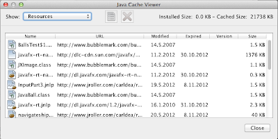
"Resources" has things that come from the Internet. Maybe it can be selected like above (show) but maybe the two lists could be put in one, i.e. Apps on top, followed by Resources.

"Deleted applications" is completely unnecessary. Someone in some meeting wanted to play safe and duplicate a trash bin. Don't Do That. Stick to simplicity. Though Java (well, JVM) is gorgeous, you don't want it to explode on people's faces. They already have enough stuff to take care of. One can always re-install an app from the original place. Trash.
That covers the first, "General" pane, and - nicely - nothing remains on it. I would claim that the proper title for the pane should have been "Miscellaneous" since these really were things that didn't fit anywhere else. Too bad they were placed on the *entry* place of the Java Control Panel.
Update

What a waste of empty space.
Merge this with the "about" popup that comes from the General tab.

I would bet that the *most* frequently used feature of Java Control Panel is to check which version you are running and possibly upgrade. Make this the entry page (it already has the nice graphics). Don't hide it behind an "About.." button.
That covers the "Update" pane, which now functions as the nice entry page within the Control Panel.
Java
It's kind of awkward to have a "Java" pane within a "Java Control Panel", isn't it? If this pane is "Java", what are the others?

Again, you probably noticed the (lack of) use of empty space, and making people push yet another Button... (A copy of this pane alone would make for 15 minutes of teaching at a University Usability Course - if people would learn by bad examples, which they don't). :)
Ok, let's be humble and press the "View..."

There comes "Java Runtime Environment Settings".
Let's forget about the unnecessary interim "Java" tab and call the tab "Runtimes" at once.
However, knowing that in the Oracle way of distributing Java for OS X there is only one runtime at any one time, I wonder what's actually the point of all this. Apple had a similar list where one could manage multiple Java Runtimes. Oracle itself has said this was a very, very bad idea. So .... what is this for?
Security

"Use certificates to positively identify .. certifications." Yeah, right.
- empty space
- button...
Just call the whole page "Certificates", and have this (what pops up by pressing the button) right on the topmost level:

Certificates is probably an even more advanced issue than Network and Temporary Files and therefore deserves to be listed after them.
Advanced

This can probably remain pretty much as-is, since the name anyways implies you should know what you're doing. A tiny help pane on the right side for getting info on the settings might not hurt (especially since the OS X Control Panel would have more horizontal page available).
Maybe reduce the font size a bit. It's advanced. There are many options. Smaller font size means I can get a better overall view at once.
Altogether, now
So the current (Oracle Java 7 SE) Java Control Panel organization is like this:
General
About...
Network Settings...
Settings...
View...
Update
Java
View...
Security
Certificates...
Advanced
The proposed flatter organization is:
Update
Network
Temporary Files
Caches
Runtime (if required)
Certificates
Other
Since essentially all the entries (except for 'Update') are advanced (already declared so in the current Control Panel implementation), it is probably in place to re-title the earlier "Advanced" as "Other".
The Theory
I've developed a theory (mainly by observing XBox/Zune and other Microsoft mess-ups) that the internal structure of an organization is traceable in the software it produces. That is, unless a special effort is taken to smoothen such borderlines from the eyes of the user. I bet that the issues mentioned above are not coming from developers. They reflect something within probably Sun and not Oracle that caused this kind of approaches to be taken. It is sad if such usability failures are allowed to live further over the years, since *this* is what most people will feel when they touch Java. Is it flat, easy and good-looking. Or is it unnecessarily structural, hard to handle, and aging.
Oracle, please decide.


